Seven scary charts – happy Halloween!
It’s that time of year again. US elections? No – something even scarier. This Halloween, we’ve found no shortage of spooky charts. Here are our top seven, showing some of the most frightening spectres lurking below the surface of financial markets… don’t read them before bedtime.
One of the scariest aspects this year is the huge disconnect between asset prices and macro fundamentals with the impact Covid-19 has had. These are certainly spooky times.
Happy Halloween!
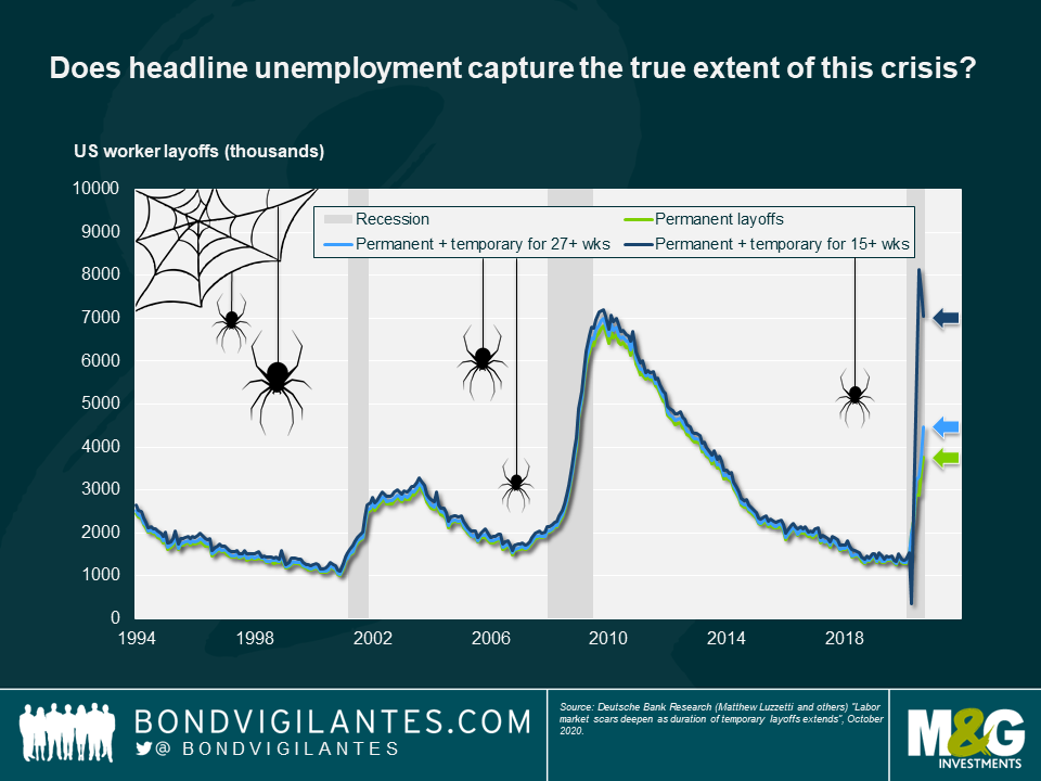
- Does headline unemployment capture the true extent of this crisis?
Reading the latest unemployment statistics, there has been no shortage of scary numbers and charts this year. Fortunately, government support and furlough schemes have provided much-needed support to many workers in developed markets, keeping both households and the economy afloat. But this brings with it a scary corollary: how many workers are unemployed and don’t know it yet? In other words, what will happen when furlough and other support schemes come to an end?
We think this chart may be even scarier than headline US jobless claims. It illustrates current unemployment figures with the addition of those who classify themselves as temporarily unemployed. If one includes workers on temporary leave for at least 15 weeks, the number of “unemployed” workers is around double the reported number.

2. Households appear better off… for now
Have we really seen the full effect of this downturn? This is a strange recession for many reasons but one of its strangest features has been that, in many developed countries, household incomes have increased, as in turn did savings rates during lockdowns.
But now that economies are reopening, consumer expenditure is back on the rise, partly funded by those savings. Beware the next “taper tantrum” if this support to households is cut off and they begin to run out of savings – this could have some much longer term consequences for the US economy than we have seen this year.

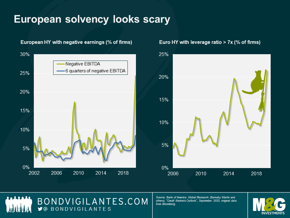
3. European solvency looks scary
Our next spooky chart reveals some worrying signs in European high yield solvency. While many high yield companies have managed to keep up liquidity during this year, balance sheets are looking rather fragile. As lockdown restrictions begin once again to tighten across Europe, poor earnings and high leverage in many companies mean we may not have seen the last of the weakness in European high yield.
Having reached highs in excess of 850bps from its January low of 300bps, the Euro high yield index is now trading with a credit spread in the 400s. Given the shaky fundamental picture that we can see in the chart, this gives a scary indication of just how much asset prices have been boosted by central bank support with a lack of underpinning earnings quality.

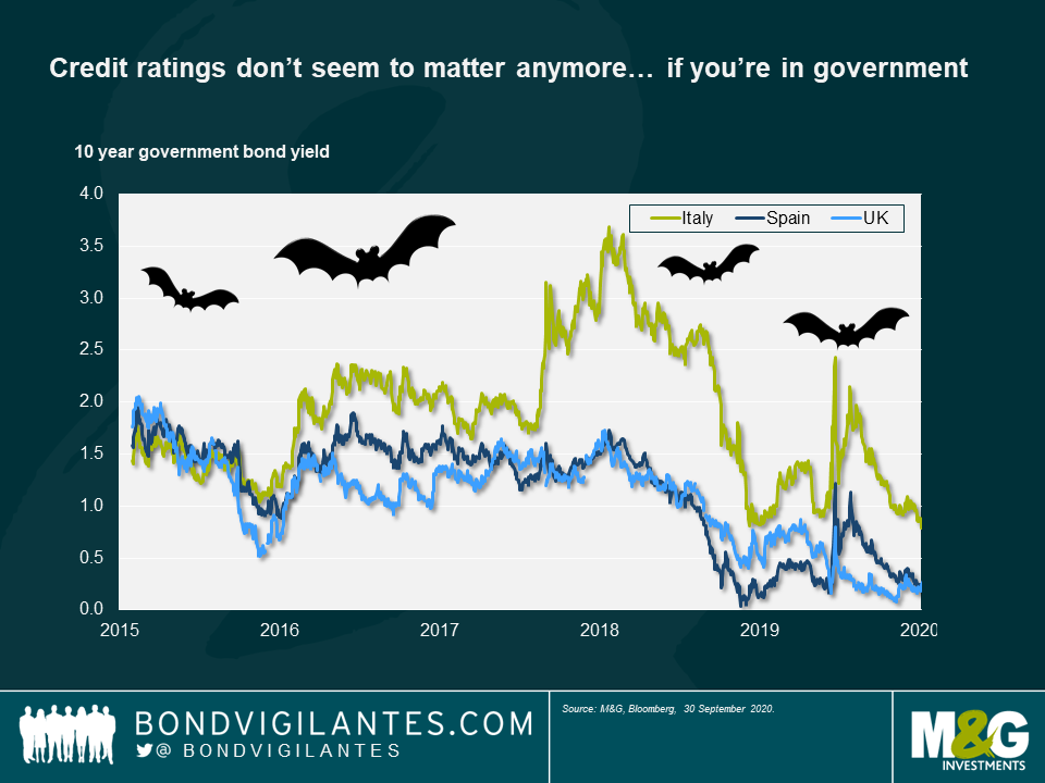
4. Credit ratings don’t seem to matter anymore… if you’re in government
Another scary sight is this comparison between yields offered by Italian debt (rated BBB-), Spanish debt (rated BBB+) and UK gilts (rated, after the recent downgrade, AA-). History tells us that peripheral European debt is a riskier investment than core European debt, and it has therefore delivered higher yields along with solid capital gains for investors as spreads have tightened.
Now we see Spanish bonds trading at the same levels as UK gilts, Italian debt converging on Spain and overall peripheral Europe risk reducing. Do credit ratings matter anymore, or is the market now more focussed on the virus and its spread?

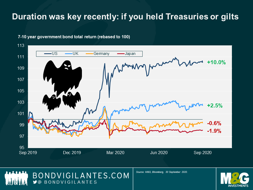
5. Duration was key recently: if you held Treasuries or gilts
This year the cushion provided by falling interest rates meant that holding duration in a bond portfolio was key in protecting investor capital—but only if that duration was in the US or UK. By contrast, Japanese and European duration posted negative returns for investors.
Why the difference? The answer is simply that the Fed and BoE had space to cut interest rates; Europe and Japan did not. Now that rates are close to zero in the US and the UK, this begs the question of where investors can go now to get such a risk-off hedge.

6. All-in corporate yields are back to pre-Covid levels
Credit spreads and corporate yields saw big spikes at the start of this year as the market struggled to predict the effect of global lockdowns on issuers’ solvency, and investors rushed to buy safe haven assets. One would expect these levels to have decreased since the height of the liquidity crunch but the extent to which they have now compressed is quite extraordinary and rather scary.
Credit spreads are still elevated versus their pre-Covid levels but take a look at the all-in yield offered to investors for lending money to companies now: in the US and the UK, these yields are unbelievably now lower than before the start of the Covid crunch, despite the clear risks and uncertainty that are still present in the economy.

7. GBP hasn’t traded as a reserve currency
One thing investors can surely bank on in scary times are the big four reserve currencies, right? The dollar, euro, yen and pound all generally provide a safe haven to investors in market downturns. But this year, one of those currencies did not behave at all as one might expect. We are of course talking about the pound sterling.
Looking at this chart, the risk-return profile of the pound looks closer to various emerging market currencies than developed ones. This gives a clear picture of the extent to which sterling is trading simply on sentiment at the moment – what does this, the UK’s recent credit rating downgrade by Moody’s and the approach of Brexit, mean for its traditional position as one of the big four reserve currencies?

The value of investments will fluctuate, which will cause prices to fall as well as rise and you may not get back the original amount you invested. Past performance is not a guide to future performance.


19 years of comment
Discover historical blogs from our extensive archive with our Blast from the past feature. View the most popular blogs posted this month - 5, 10 or 15 years ago!


Bond Vigilantes
Get Bond Vigilantes updates straight to your inbox


