
A 1 in 3 chance of US recession – is Greenspan right?
We’ve talked a fair bit about the possibility of a significant US slowdown over the course of the next twelve months (see here). Now that we’ve cracked the dark arts of posting charts on our blog, I thought it’s worth showing you the simple yield curve analysis that lies behind both Greenspan’s, and the current Fed’s, thinking. History shows us that when long term bond yields in the US fall below the Fed Funds rate, the US economy slips into recession within a year.
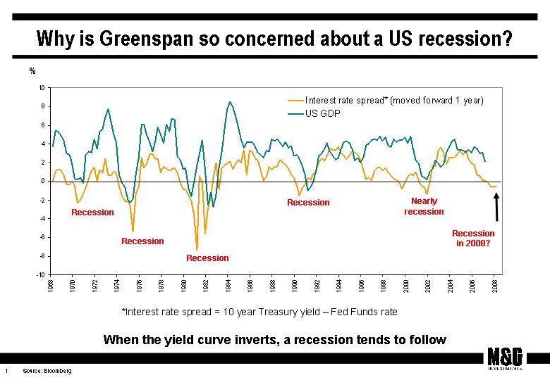
The chart above shows this happening in the early 1970s, mid 1970s, early 1980s, early 1990s, and in 2001 (marked as “Nearly Recession” on the chart – we didn’t see negative GDP growth, but US recessions are “declared”, like Port vintages rather than scientifically measured!). It’s been a very accurate predictor of economic weakness, and the bad news is that we’ve seen an inversion in the yield curve for several months now, implying that there will be a recession next year.
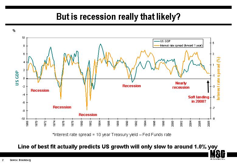
Our next chart is less pessimistic though – it plots the “line of best fit” for the relationship between growth and the yield curve. On this measure you might expect a soft landing in the US next year, with annual GDP growth of perhaps 1%. This is still way below trend growth though (3-4%?), and as such an output gap is opening up – we have already had almost a year of sub-trend growth in the States. In my view this growing output gap is disinflationary (actual growth being below the potential of the economy), and helps explain why core US inflation data have been well behaved lately, and should remain subdued going forwards. This is better news for government bonds, which have been in a bear market.
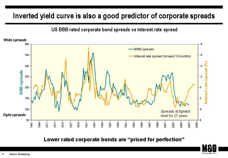
Where we worry most is in the yield curve’s predictive powers for credit spreads. Our third chart shows that BBB rated bonds (the lowest rated investment grade companies) are paying the lowest premium over government bonds for nearly 30 years. If we show the yield curve chart against this (and inverted) we can see that the historical relationship has broken down aggressively in the last couple of years. Given the yield curve is suggesting an economic slow down, we would expect credit spreads to have widened to reflect a riskier world and future higher default rates – but they haven’t done so. The simple model might predict that corporate bond yields should be around 200 bps more than government bond yields, rather than just over 100 bps as they are right now. As a result we think lower rated corporate bonds are expensive, perhaps simply reflecting an excess of demand (for example from the CDO market) in a period when we feel monetary policy has been too loose. Our funds are defensive in terms of our credit exposure – the yield curve has a good predictive track record, and it feels right to draw in one’s horns and take some chips off the table (to mix metaphors) at this time of the economic cycle.
The value of investments will fluctuate, which will cause prices to fall as well as rise and you may not get back the original amount you invested. Past performance is not a guide to future performance.
19 years of comment
Discover historical blogs from our extensive archive with our Blast from the past feature. View the most popular blogs posted this month - 5, 10 or 15 years ago!


Bond Vigilantes
Get Bond Vigilantes updates straight to your inbox