


It’s Halloween so time for some spooky, if not downright scary charts
Some people will watch a scary movie on October 31st. Others like to go to costume parties and dress up. For us, there is no better way to scare ourselves silly than by reading a few IMF reports. So in the spirit of the holiday, here are five scary charts. Boo!
1. An oldie but a goodie – high public debt-to-GDP ratios
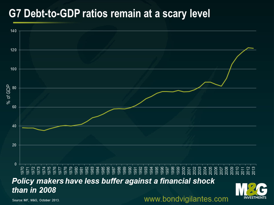
Economic theory has told us for a long time that debt held by the public is what we should be looking at when trying to work out the potential impacts that high debt levels could have on an economy. This is because the borrowing associated with government debt competes for capital with investment needs in the private sector (for factories, equipment, housing, etc) and can affect interest rates. A good ol’ classic case of “crowding out” in the IS-LM model.
More recently, the market has taken its focus off looking at debt-to-GDP ratios. A 2010 research paper by Carmen Reinhart and Kenneth Rogoff was found to have computational errors, resulting in some serious question marks being raised about their finding that a debt-to-GDP ratio of 90 per cent or more is associated with significantly lower growth rates. Following this debacle, we now know that there is probably no magic threshold for the debt ratio above which countries pay a marked penalty in terms of slower economic growth. For all it’s importance, the 60% debt-to-GDP ratio target written into the Maastricht Treaty adopted by the European Union was pretty much based on zero economic evidence.
This doesn’t mean we shouldn’t keep an eye on the measure though. High government debt means a high debt servicing cost. In general, a lower debt-to-GDP ratio is preferred because of the additional flexibility it provides policymakers facing economic or financial crises. What has now changed is that it has been acknowledged by policy makers that lowering the debt ratio comes at a cost to economic growth, requiring larger spending cuts, higher revenues, or both. Should the financial system face another wobble, for whatever reason, we would have to question the capacity of governments to step in and support their banks like they did back in 2008.
2. Deteriorating health and ageing in the developed economies
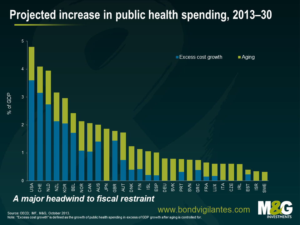
The world’s population is growing older, leading us into uncharted demographic waters. There will be higher absolute numbers of elderly people, a larger share of the elderly, longer healthy life expectancies, and relatively fewer numbers of working-age people. We are aging due to three underlying factors: increased longevity, declining fertility and the baby boomers getting older.
This signals a profound economic and social change, with big implications for businesses and investors. Will we see an asset meltdown as the elderly sell off their assets? How will publicly funded pension systems deal with rising beneficiaries and falling contributors? How will policy makers react to a chart like the one above, which shows ever-increasing expenditure on public health as a percentage of GDP? The need for policy adaptations to an aging population will become more important in the face of retirement of the baby boomers, slowing labour force growth, and the rising costs of pension and health care systems, especially in Europe, North America, and Japan.
As a result of this key demographic change we can now reasonably expect to retire later in life, work harder as the size and quality of the workforce deteriorates, and pay higher taxes to fund those expensive medical technologies. Scary, huh?
3. Economic inequality and its impact on society
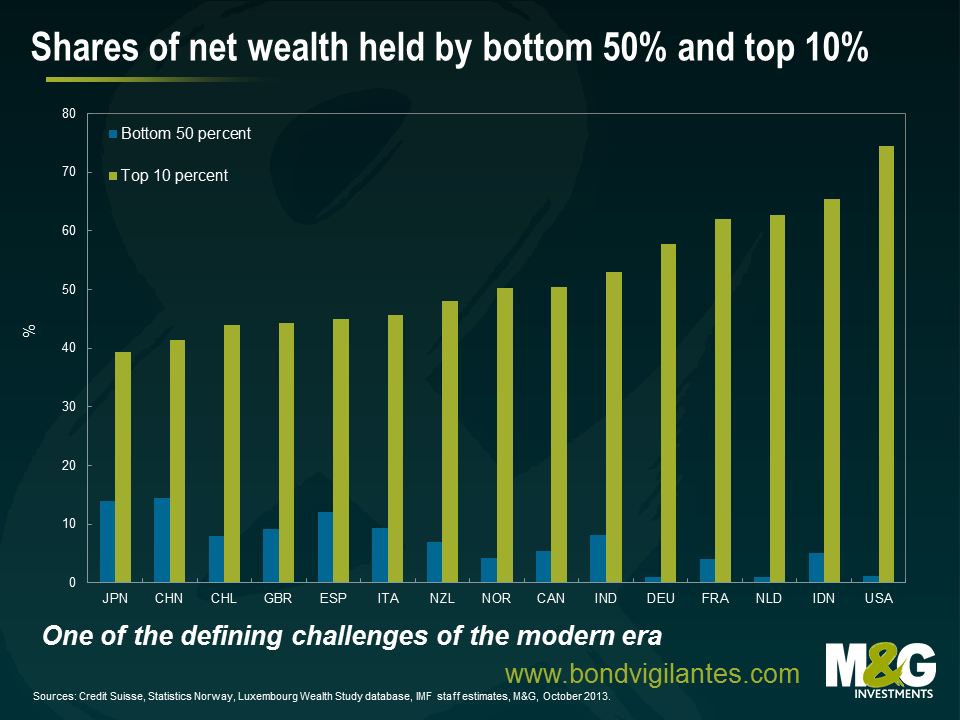
Income inequality is of great interest to economists due to the impact that it could potentially have on economic growth. Robert Shiller, who recently won the Nobel Prize in Economic Science, said that income inequality is the most important problem that we are facing now. Billionaire investor Warren Buffett thinks that rising income inequality is a drag on US economic growth. He said in an interview with CNN Money that “the rich have come back strong from the 2008 panic, and the middle class hasn’t. That affects demand, that affects the economy. The people at the bottom end should be doing better.” Stan Druckenmiller, who spent more than a decade as chief strategist for George Soros, has described QE as causing “the biggest redistribution of wealth from the middle class and the poor to the rich ever. Who owns assets? The rich.”
What is really scary about this chart is the social and political ramifications that some economists have hypothesised. One theory suggests that high inequality could lead to a lower level of democracy, high rent-seeking policies, and a higher probability of revolution. An economy could fall into a vicious cycle because the breakdown of social cohesion brought about by income inequality could threaten democratic institutions.
4. A new economic world order
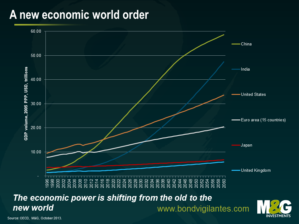
The last decade has witnessed the emergence of China as an economic superpower, the next decade may well be characterised by the emergence of India. China and India will both expect their global influence to expand in the coming years and decades, but strong growth will not be without some headaches. Political leaders must deal with the environmental consequences, an aspirational middle class and rising social inequality. We have all felt the impact of the ascension of the developing economies through their thirst for commodities; the next phase may well see these two nations become the most influential in the world.
Markets don’t particularly like uncertainty. How they react to this new world order is anyone’s guess. This chart isn’t particularly frightening. What it does is challenge the economic status quo that many of us have become accustomed to.
5. Feeding the world
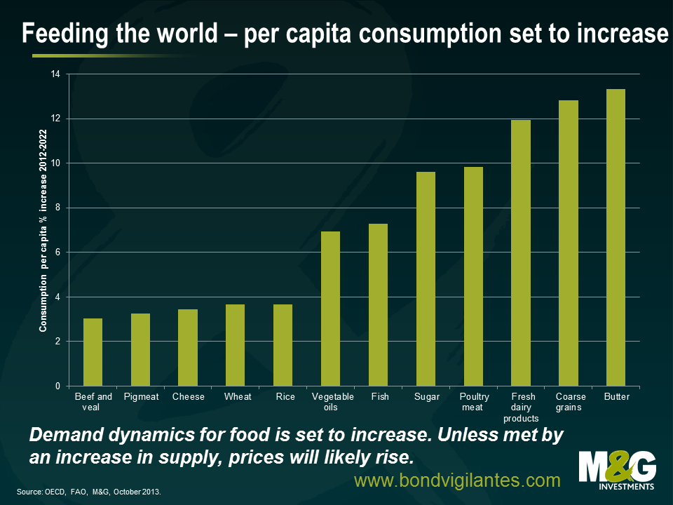
The global population is set to grow considerably in coming years, though there will likely be considerable differences across countries. It has been estimated that the world’s population could increase by 2 billion people to exceed 9 billion people by 2050. Of course, global agricultural production will have to increase in order to meet this demand. If our farmers don’t manage to produce more, then we could easily find ourselves in an inflationary environment as our grocery shopping bills increase. Not only that, we have to become much smarter about using the planet’s limited resources.
Increasing farmers output won’t be easy, or without cost. Recent experience suggests that an increase in production efforts can lead to significant negative environmental effects, like pollution and soil erosion.
Increased productivity and innovation alone will not tackle the demand that will come from our growing, global population. Investment and infrastructure is vital. Farmers are likely to adopt technologies only if there are sound incentives to do so. This calls for well-functioning and efficient capital markets, a stable financial environment and sound risk management tools.
The value of investments will fluctuate, which will cause prices to fall as well as rise and you may not get back the original amount you invested. Past performance is not a guide to future performance.
19 years of comment
Discover historical blogs from our extensive archive with our Blast from the past feature. View the most popular blogs posted this month - 5, 10 or 15 years ago!


Bond Vigilantes
Get Bond Vigilantes updates straight to your inbox