Macroeconomics
The US Dollar: from exceptional to average?
By Eva Sun-Wai
23 February 2026

Historically I’ve struggled with the concept of gold as an investment. Presumably if you bought gold for this purpose you would want to store it somewhere safe and insure it. However, investors in gold should account for the fact that there is a cost to sleeping well at night. Vaults and insurance don’t come for free, and that cost can be thought of as a negative yield or the demurrage of gold.
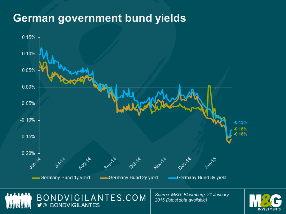
As a bond fund manager a negative yielding investment was something of an anathema. The “was” in that sentence is quite illuminating. Bond investors have been living in a world where some bonds have been paying negative yields for a while now. Investors at the front end of the German bund curve, for example, have effectively been paying for the pleasure of owning those bonds since late summer last year.
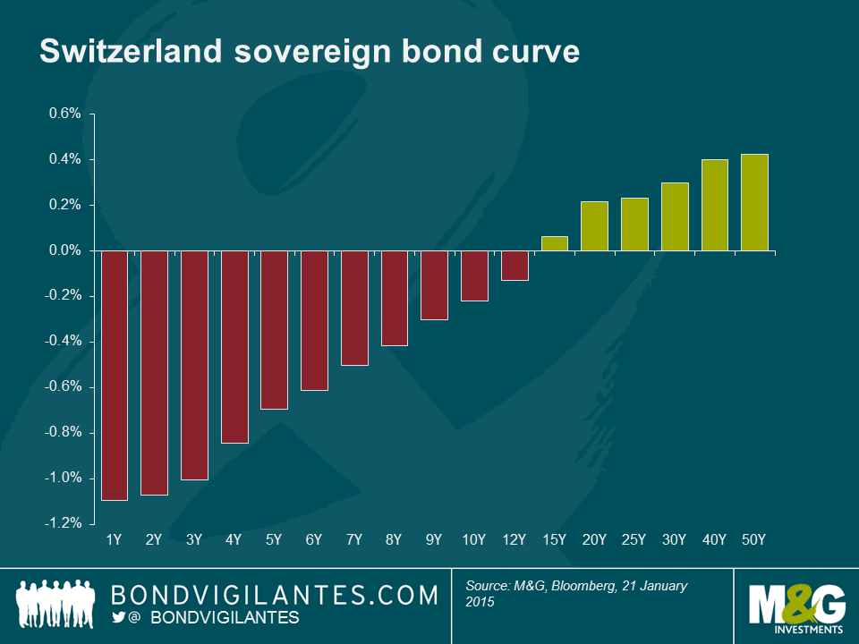
This got me thinking, how negative do bond yields need to get before investing in gold is relatively cheap from a yield perspective? With a quick google search I found that for those wishing to store less than 15 bars of gold (over $7.5m worth at today’s prices) the cost of storing and insuring it is about 12 basis points (bps) a year. As you can see from the chart there currently isn’t much in it between gold and short dated bunds.
For traditional bond investors concerned with at least maintaining the nominal value of their investment, gold isn’t the most reliable asset. Perhaps just holding cash is the answer, but with interest rates on bank accounts in Europe also turning negative what is a conservative investor to do?
A bit more googling unearthed how much it costs to rent a safety deposit box at a bank, and how big a pile of dollar bills is. I was then able to calculate how much it costs to own a box full of dollars for a year. The negative yield on cash stored in such a way depends largely on how much of it you have. At the bank whose boxes I was browsing, anything less than about $400,000 dollars costs around 7 bps per year whereas amounts over $3m would cost 3 bps a year.
Unsurprisingly I’m not the first person to think of this, as the Swiss National Bank’s website points out, 61% of all bank notes in circulation are made up of CHF 1,000 notes! They go on to state that “The high proportion of large denominations indicates that banknotes are used not only as a means of payment but also – to a considerable degree – as a store of value”. In an economy experiencing deflation, with a large proportion of its government bonds yielding less than zero, a safety deposit box that costs a few basis points a year appears to be a sound investment… until someone decides to steal it that is.
Sadly I haven’t been able to find anyone willing to insure a safety deposit box filled with currency, but if you really wanted to store a large amount of cash you could always build a fortress and hire some mercenaries to protect it. At this point admittedly things start to get rather hypothetical (I hope you’ll forgive me for not looking for quotes whilst at work), but I think it’s safe to assume it would cost more than a few basis points a year. Whatever the cost of such a facility, it would surely put a floor under how negative interest rates could go. Only a full move to electronic money and the end of physical storage could remove this bound (and also end lots of criminal activity and tax evasion too).
Back in reality… If Mario Draghi announces – as is widely expected – full blown quantitative easing later today I think we will see more assets trading with negative yields and more discussion around the relative demurrage between assets. In a world of negative government bond yields, risk aversion and deflation, cash is king.
Guest contributor – Eric Lonergan (Fund manager on M&G’s macro hedge-funds and multi-asset team, and author of “Money”)
We need more cash, not less.
Many economists just assume that central banks have hit “the zero bound” on interest rates and that conventional policy is thereby exhausted. Take Ken Rogoff’s bizarre proposal as an example:
“The idea of finding creative ways to get around the zero bound on interest rates has been championed for more than a decade by Willem Buiter, a former UK Monetary Policy Committee member. Phasing out paper currency is by far the simplest.”
Let’s forget about the idea of phasing out paper currency. What’s really odd is the assumption that we have hit a “zero bound” on interest rates. This has troubled me for some time. In economic theory and discussion we often just assume there is a single interest rate. The classic Solow growth models collapse all interest rates of all maturities and risk characteristics into a single r, the cost of capital and the return on savings.
Now economists often seem to slip into assuming that in the real world we have “zero interest rates” because the official overnight interest rate is close to zero. Bob Lucas alludes to this. One thing I like about Lucas is he sometimes states obvious things that everyone seems to be ignoring which are highly relevant. I was listening to this brilliantly clear lecture by Lucas where (at 9:20) he points out that no one in the real economy is borrowing at zero. In fact, in many cases, as the fed funds rate has fallen further, spreads have widened.
Eyeballing Lucas’s data, it looks out-of-date to me. Spreads on many forms of credit have compressed further, although his basic observation is correct: no one is borrowing at zero. He also omits one of the most important “interest” rates, the equity cost of capital. This is a repeatedly omitted factor in economic discussion for no good reason – perhaps because it is not directly observable. When firms weigh up investment decisions the cost of equity is central. Forget about a zero bound on the cost of capital, the real earnings yield on global equities is closer to 6%, or a nominal 8%.
How can we further reduce interest rates? Let’s start by defining the “true zero bound” (TZB). Sticking to the United States, the easiest official interest rate to understand is the discount rate. This is the rate of interest at which deposit-taking institutions (banks) can borrow from the Federal Reserve. Typically these are overnight loans, and the borrowing bank has to provide collateral. Currently the US discount rate is 75bps.
Ok, so currently banks can borrow, against collateral, overnight, at 75bps. That looks nothing like a zero bound to me. I have italicized each of the areas where policy can be eased. If we want to reduce interest rates there are four obvious areas to do it. Lend to non-banks, extend the maturity, relax collateral requirements, and reduce the interest rate. Logically, the TZB is when the central bank lends to anyone at infinite maturity, at a zero nominal interest rate, in unlimited amounts, and requires no collateral. Any activity can be financed at zero interest rates, so all interest rates are zero.
It goes without saying that we aren’t even close … anywhere. It also goes without saying that it would work. If any central bank went to unlimited TZB there would be a surge in demand, then inflation, and if they didn’t stop, hyperinflation. (As an aside, this line of reasoning reveals that the liquidity trap is a myth). So if we want to reduce interest rates further there are two options. Move gradually, step-by-step, towards the TZB, or go straight to the TZB and limit its scale.
The ECB is already doing the former. That’s what TLTROs etc are: a gradual extension of maturities and a relaxation of collateral requirements. Arguably, the Fed’s “credit easing” and the ECB’s purchases of asset-backed securities are an attempt to lend beyond the banking system.
I think it would be better to go straight to TZB, but limit the amount. In fact, that is precisely what Mark Blyth and I argue in our Foreign Affairs article. Cash is analogous to an infinite maturity loan at a zero nominal interest rate.
So let’s actually try zero interest rates. The US economy doesn’t need anymore stimulus, but the Eurozone clearly does. The ECB should move to the zero bound: allocate maybe 3% of GDP to infinite maturity, zero interest rates loans, to everyone. If that doesn’t work, we can think about the unconventional.
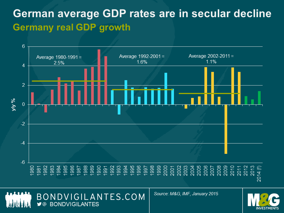
The German government can theoretically borrow at negative yields if it were to issue short maturity debt today. Longer maturity debt is also yielding a record low amount. Could the collapse in yields be a blessing for Germany and Europe? Two economists at the International Monetary Fund (IMF) seem to think so. Indeed, the German government’s narrow-minded pursuit of the “black zero” (a balanced budget) could be precisely the wrong thing to do at this point of the economic cycle if the Eurozone is going to continue to move forward with its current membership intact.
In a recent working paper entitled “Das Public capital: How Much Would Higher German Public Investment Help Germany and the Euro Area?” IMF economists Selim Elekdag and Dirk Muir outline the case for a German infrastructure spending boom. They argue that higher German public investment would not only stimulate domestic demand in the near term, but would also raise domestic output over the longer-run and generate beneficial spillovers across the euro area.
Public investment in Germany is the second lowest in the OECD (1.5% of GDP), while net public investment has been negative since 2003. Years of underinvestment has led to a deterioration of the public capital stock, suggesting that this is a good time to increasingly invest in public infrastructure. And there are areas that a public infrastructure programme would particularly benefit, including aging bridges and roadways. Given that German average GDP rates have been declining since 1980 and has been below trend more recently, the German economy could use a shot in the arm to stimulate economic growth and would benefit greatly from some added stimulus measures. Unlike public consumption – which tends to provide a short-term boost to economic growth if not sustained – an increase in German public investment would raise domestic GDP more durably in both the short and long-term as infrastructure projects become productive public capital.
The IMF economists find that a 4 year, 0.5% of GDP increase in German public investment (which is consistent with Germany’s fiscal rules) would yield a persistent increase in real GDP of 0.75%. Perhaps equally as importantly, the spending programme would also raise growth in the euro area, with peak effects on real GDP in Greece, Ireland, Italy, Portugal, and Spain (considered together) of 0.3%. The spillover effect into the rest of the euro area is transmitted through a couple of key channels. Firstly, positive effects for other euro area nations are caused by Germany demanding more goods from their euro area trading partners. Secondly, the inflation rate would be higher in Germany as demand increases, resulting in a real effective exchange rate depreciation for the rest of the euro area thereby making these nations more competitive. This is vital at a time when Europe is scrambling to generate any growth it can get.
The decline in inflation expectations across Europe, and some stabilisation in the prospects of the peripheral nations, has seen yields collapse not only for Germany but also the rest of the Eurozone. If European politicians could get their act together and exploit the low yields on offer (as ECB President Mario Draghi has implored them to do) and embark upon a coordinated effort to increase public investment across Europe, this would have some significant results on economic output. A coordinated fiscal stimulus (defined as a 2-year, 1% of GDP debt-financed increase in public investment) across the Euro area would generate a sustained 1.2% and 1.1% increase in German GDP and other Euro area countries respectively. If the economics is sound, why won’t the German government act?
The answer lies in the views of the German electorate. There is a fear within Germany that they will end up indefinitely subsidising the whole European periphery (much like the German West has been subsidising the East for the past 25 years with no end in sight). In order to avoid getting into a situation in which the German government has to pick up the bill for European peripheral debt, Germany is trying to enforce austerity on the whole Euro area. The only way Germany can credibly do that is by leading by example, like parents teaching children to eat vegetables. If Germany ramped up public investment and started running deficits now, it would have no (moral) authority whatsoever to make any demands on peripheral countries to keep budgetary discipline.
So at this stage it appears that project “black zero” is all encompassing for the German government and electorate. The type of coordinated effort that Europe needs – a combination of stimulatory fiscal and monetary policy – appears out of reach. Without the coordinated effort of policymakers, it is difficult to see how Europe will generate higher living standards over the longer term for its 330 million inhabitants.
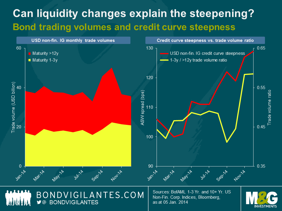
Credit curves are usually upwards sloping; as you’d expect, investors require more of a credit risk term premium for lending for a long time than for a short time, all else being equal. As the charts below show however, the steepness of USD IG non-financial credit curves has become rather extreme in 2014. At year end, the asset swap (ASW) spread differential between c. 25 years and c. 2 years weighted average life (WAL), a simple measure for curve steepness, had risen to 129 bps, which is within the top quartile of monthly readings over the past decade. In contrast, the EUR IG credit curve steepness has not followed a clear trajectory in 2014, bouncing back and force between values in the high-50s to mid-60s bps range (c. 14 years into c. 2 years WAL).

So what has been driving the steepening of the USD IG credit spread curve? We first took a look at liquidity levels of USD IG non-financial corporate bonds, using TRACE (Trade Reporting and Compliance Engine) market flow data as a proxy. As shown in the charts below, the ratio of short-dated to long-dated bond trade volumes has ticked up in the course of last year. The steepening of the credit curve might therefore be partially explained by investors calling for an increasing spread differential between long- and short-dated bonds as reimbursement for the relative liquidity decrease at the long end compared to the short end. Liquidity considerations cannot be the only relevant factor, of course. From August to October, for example, credit curve steepness and trade volume ratio moved in opposite directions. Also, our trade volume based liquidity measure does not take into account whether bond buying or selling dominates. Therefore, higher liquidity levels do not necessarily translate into lower credit spreads, and vice versa.
It is quite possible that in fact the focus on yield of USD credit investors has been the major reason for the steepening of the credit spread curve. The chart below shows the evolution of credit curve steepness and, on an inverted vertical axis, U.S. Treasury (UST) yield curve steepness (difference between 30 year and 2 year generic UST yields) over the past 5 years. The curves show a remarkably strong negative correlation (-0.7), i.e., a flattening of the yield curve usually coincides with a steepening of the credit curve, and vice versa. Hence, the steepening of the USD IG credit curve throughout the past year might have actually been driven to a large extent by yield investors demanding a higher and higher spread premium for long-dated credit exposure to get compensated for the lower and lower UST yield pick-up, which has dropped from nearly 330 bps in January 2014 to c. 210 bps at year end.
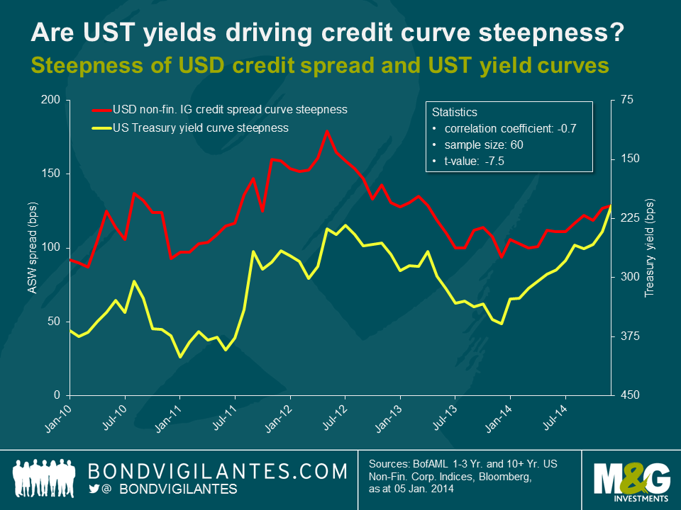
Corporate bond investors have to take the inverse relationship between credit curve and UST yield steepness into account. On the one hand, they can pick up an extra credit spread of c. 130 bps at the long end. But on the other hand, the extra yield on 30 year vs. 2 year Treasuries has shrunk considerably. Currently, the differential amounts to only around 195 bps, the lowest steepness reading since January 2009. However, if investors are able to take pure credit risk exposure, for instance using a UST futures overlay, long-dated USD IG credit does look rather appealing at the moment. The question is, whether the steepening of the credit spread curve is likely to continue or not. If the shape of the UST yield curve is indeed the dominant factor, then a lot will depend on how the yield curve reacts to possible (and widely anticipated) rate hikes by the Federal Reserve in 2015. Unsurprisingly, rate hikes in the past have usually been accompanied by a flattening of the UST yield curve. So there is a chance that the credit spread curve continues to steepen against this backdrop. However, as UST yield curve steepness has already fallen by c. 120 bps in 2014 (and another c. 15 bps in January 2015), arguably the effects of gentle rate hikes in 2015 have already been priced in to a large extent by now.
As we started 2014 the US Treasury market was expecting 10 year yields to be at 4.13% in a decade’s time. This 10 year 10 year forward yield, derived from the yield curve, is a good measure of where the bond market believes yields get to if you “look through the cycle”, and disregard short term economic trends and noise. I wrote about it here and suggested that we were approaching the top of the yield cycle. The reason I thought this was that the FOMC members tell us (through a range of point forecasts, one for each FOMC member, known as “the dots”) where they think the long term Fed Funds rate will end up – in other words looking through the cycle. As mathematically a long bond yield should equal the sum of all the overnight rates over the life of a bond, the FOMC’s long term expected Fed Funds rate should have a good relationship with the long term US Treasury yield. In that blog I did also say that there should then be an adjustment for a term premium – the additional yield that a bond investor would demand for lending to a government for 10 years with all of its uncertainty and credit risk rather than lending overnight. We’ll come on to that, but you can see that since January 2014 forward bond yields have collapsed from that 4.13% to around 2.75%.
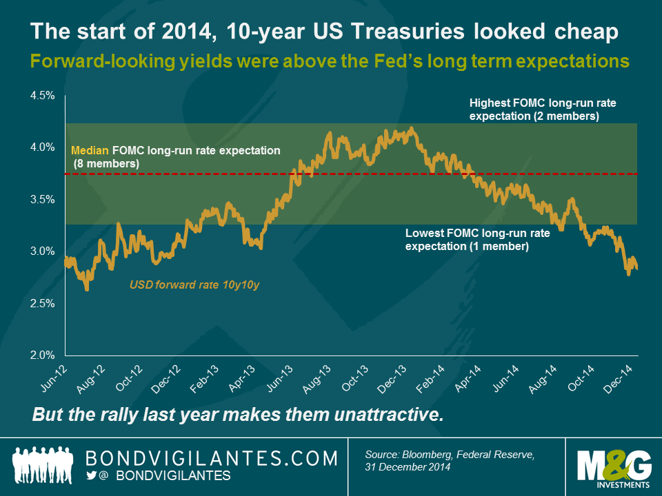
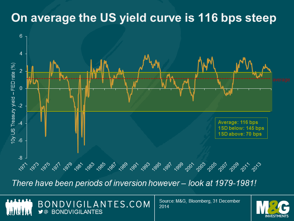
The 10 year 10 year forward yield at 2.75% is below even the most dovish member of the FOMC’s expectation of the long term Fed Funds rate (the lowest forecast is 3.25%). On the face of it we’d suggest that there is little value in long Treasuries at the moment. But it’s even worse than that. Let’s look at what the typical yield pick-up is between Fed Funds and the 10 year US Treasury. Going back to 1971 the average spread between the two instruments is 1.16%. There have been periods of inversion, where Fed Funds is above longer dated yields, most notably at the start of the 1980s when Paul Volker decided to kill inflation by hiking rates above the CPI rate, and thus made long dated bonds investable again. The spread between the Fed Funds rate and 10 year bond yields is largely about term/risk premium, but it might at times reflect a central bank regime change (like Volker) or expectations of a turning point in the rates cycle (here’s the excellent New York Fed’s Liberty Street Economics blog on drivers of the term premium in the US Treasury market). On the whole though the curve is positive, with a 1 standard deviation band of +70 bps to +145 bps.
It therefore follows that as a measure of “value” the Fed’s long term expectation band isn’t enough; we should add on the typical curve slope (116 bps) to the FOMC members’ expectations to reflect the risk premium. The chart below shows that this obviously makes long dated US Treasury bonds look even more extremely overvalued – around 200 – 300 bps overvalued. This is a capital overvaluation of somewhere from 15% to 25%.
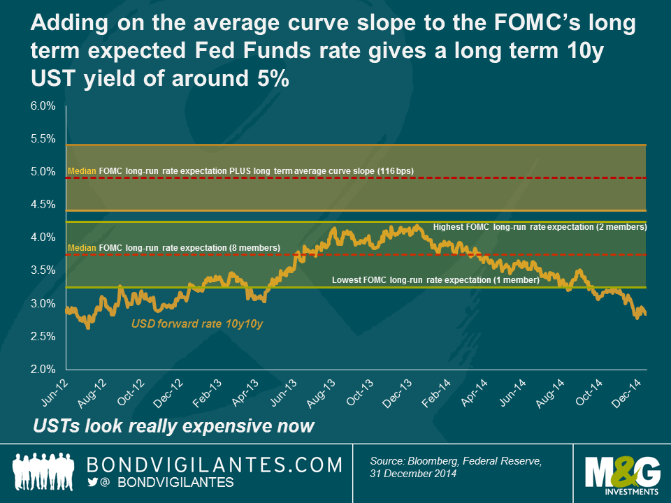
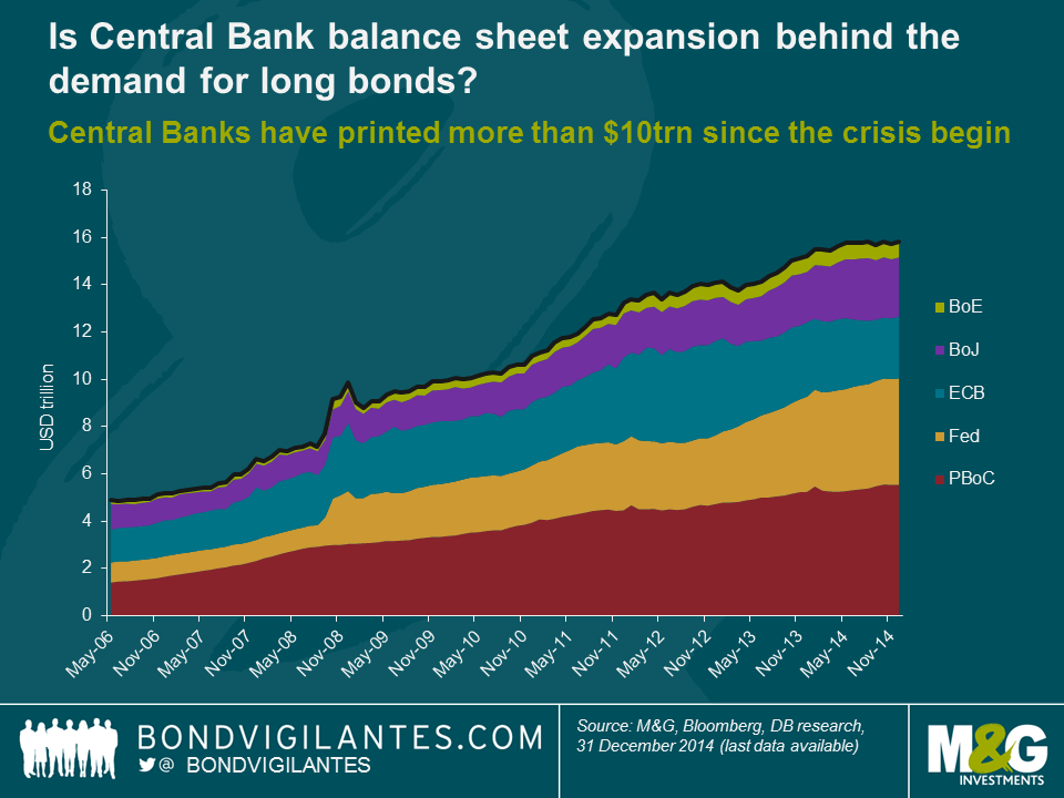
So what scenarios make today’s forward bond yields look reasonable? Most obviously the Fed could be getting things very wrong. Maybe we are in “secular stagnation” (permanently low growth and inflation due to demographics and the debt overhang) and the Fed Funds rate from 2024 to 2034 isn’t going to be 3.75%, but 1.5% or lower. That would work. Additionally the curve might be much flatter in future than historically – perhaps driven by pension fund demand for long dated fixed income given the huge hole that has opened up in America’s pension schemes. But it’s quite hard to imagine the massively inverted yield curves (-600 bps in 1980/81) of the Volker years given the low starting point for yields. Finally – and this is Deutsche Bank’s Torsten Slok’s most likely explanation – maybe value doesn’t matter anymore. The expansion of central bank balance sheets has created more than $10 trillion of new money since the Great Financial Crisis, and it is this money looking for a return of any kind in a zero rate world that has, and could continue to, drive yields down. Of the 5 central banks I’ve put on this chart only two have called an end to QE, and one – the ECB – has barely got started yet. On most valuation measures though, there’s not a lot to like in the US Treasury market. Although I wouldn’t go as far as Chinese credit rating agency Dagong on this (“Russian Debt Safer than US”).
2014 was quite an eventful year for Emerging market (EM) fixed income. After a period of strong performance which lasted all the way to September, markets corrected significantly in the latter part of the year as the escalation of the Russia crisis and the plunging oil prices triggered the most significant drawdown since the “taper tantrum” of June 2013. All in all, emerging markets still posted a positive total return in 2014, despite the declines in local currency markets (see chart 1). Particularly important at this point of the cycle, asset allocation and avoiding a few deteriorating credits were key for performance.
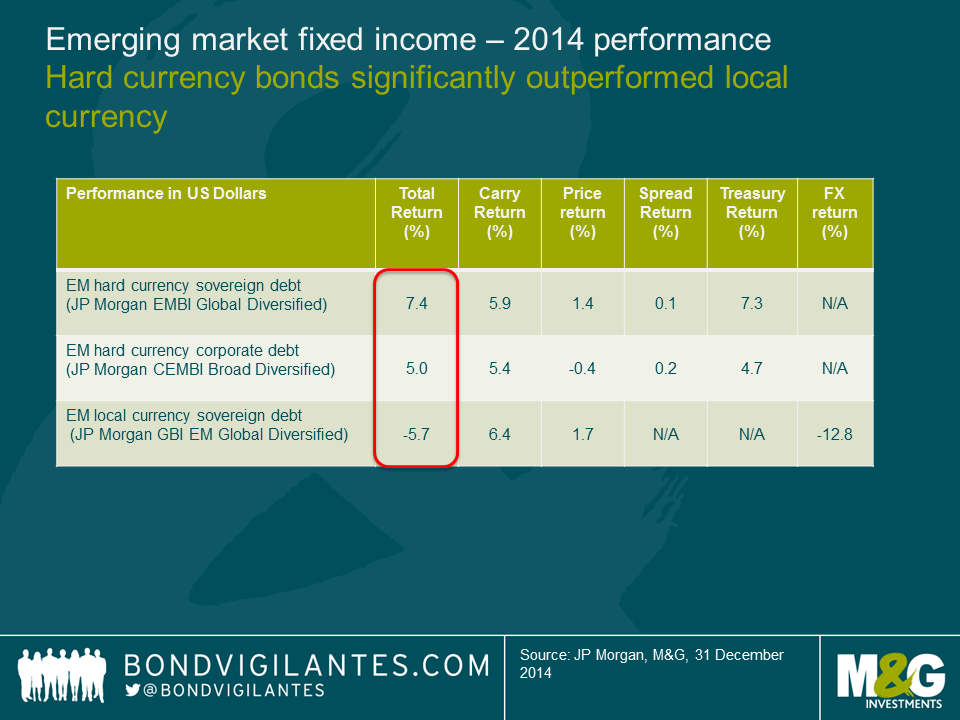
US Treasury yields rallied and this was one of the main tailwinds for returns – and also one of the biggest surprises of 2014. This made the asset allocation between hard currency and local currency a critical call – much more than what I had anticipated. While lower oil and commodity prices can help at the margin, they matter much less for US CPI than for other EM countries. The labour market and wages should remain more relevant for US monetary policy.
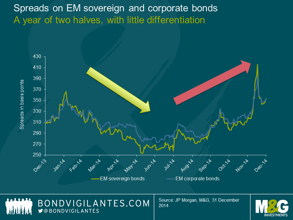
Sovereign and corporate bond spreads ended the year about 40 basis points wider.
However, this masks two very distinct periods: tightening until the summer (as investors had been cautiously positioned in terms of risk and had to invest given the inflows into retail bond funds) and widening since then (as inflows have been reduced and risks have risen, particularly for the oil exporting countries). The latter countries have been the clear underperformers as the price of crude oil tumbled from $75 to $55 USD per barrel. With the markets testing OPEC’s response (or lack thereof), the oil credits will remain under pressure until there is more clarity on what the new floor for oil prices is.
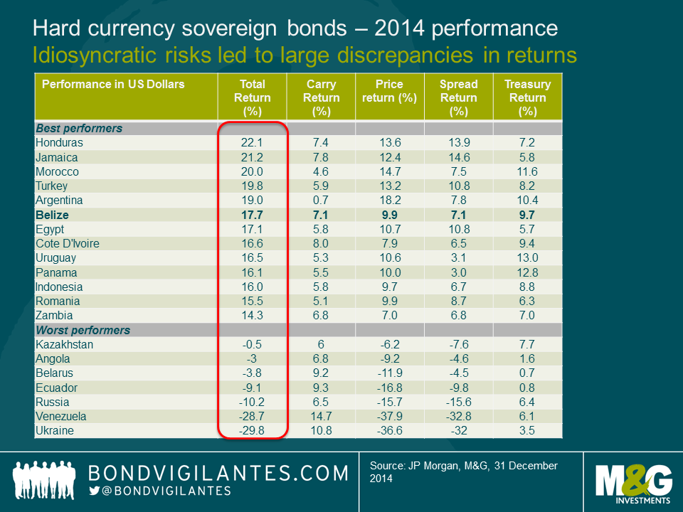
Despite the recent correction, the asset class has been able to cope thus far with lower capital inflows than in prior years and this is part of a multi-year adjustment. The dispersion of returns between hard currency sovereigns and corporate bonds was lower than I had anticipated – partially reflecting the more benign US rate environment, with the tails impacting primarily weak credits such as Venezuela and Ukraine.
For 2015, I expect higher dispersion of returns, particularly in the credits that are under scrutiny by the markets. The jury is still out on whether these governments will deliver the required fiscal or structural adjustments necessary to stabilize debt levels (including countries that are being squeezed by lower commodity prices) and structural reforms required to increase potential growth. I remain very cautious on security selection in Brazil and South Africa and am avoiding select frontier markets (Ghana, Costa Rica, Serbia) and oil credits (Bahrain, Ecuador), where I believe investors are underestimating risks and where the adjustments are likely to disappoint.
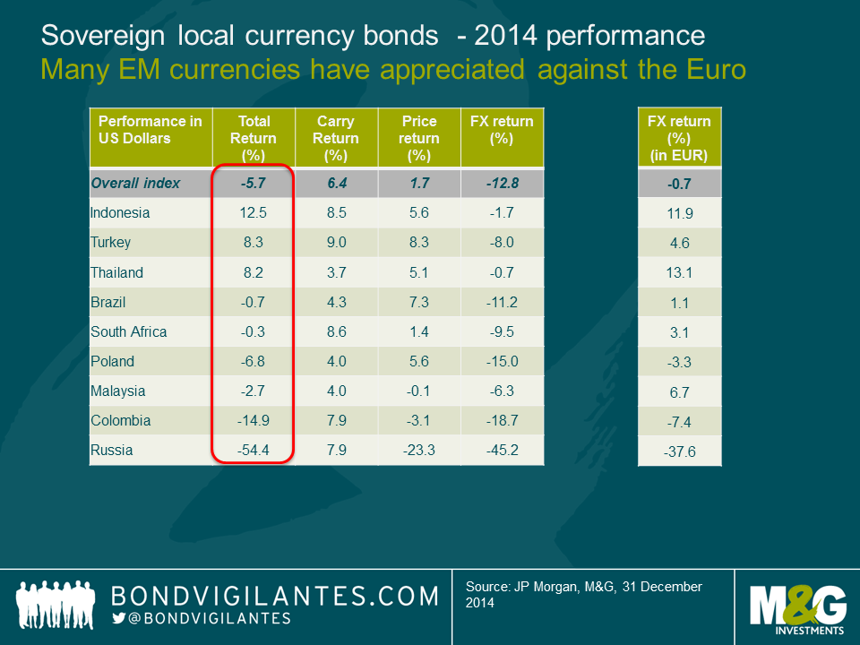
The US yield rally helped to anchor local currency curves in various countries, but was not enough to offset the negative returns from EM currency depreciations against the US dollar. In all but one market (China), rates outperformed currency returns. EM currencies actually outperformed several developed currencies, particularly the EUR, but also NOK (oil theme) and AUD/CAD (commodity theme) and I view this year as being largely a USD rally as opposed to an EM sell-off (the Ruble being the most notable exception). In many instances, the currency depreciation has been relatively orderly and/or has not had a negative effect on sovereign or corporate balance sheets. Hence, it has not contributed to significant spread widening. A few countries, however, remain under severe pressure and have been amongst the underperformers. The magnitude of the Russian underperformance was staggering, which was one of the factors that caused its GBI-EM index weight to be reduced from 10% to 5%. EM local currency debt would have delivered only a small negative return (about -1%) had Russia been excluded. I remain cautious on currencies where the adjustment is still incomplete and where terms of trade have worsened, particularly in less flexible regimes such as Nigeria or former Soviet Union countries with strong economic linkages to Russia. After having a relatively low allocation to local currency debt in 2014, I am looking to selectively add exposure in 2015 to countries where the current account adjustment is advancing and/or valuations undershoot fundamentals. Indonesia and India were such examples in 2014 and managed to perform well despite a strong USD environment.
I expected idiosyncratic risks in 2014 to become a more relevant source of returns, particularly political risks. I factor political risk by assessing whether it impacts the economy and whether the economy impacts asset prices, which is what we ultimately invest in.
In some cases, political risks had a positive impact (e.g. Indonesia and India). In other cases, while it impacted the economy, it had muted impact on asset prices (e.g. Thailand, which has had a long history of military involvement, with typically little impact on asset prices).
In other cases, political risks increased materially (e.g. Russia and Ukraine), which is having a significant impact on their economies and asset prices. I remain cautious on our exposure to these countries, as the ongoing instability risks spilling into a banking and regional crisis. One year into the conflict, I still do not see a speedy resolution in sight as the positions remain far apart and the west in no hurry to lift the economic sanctions, particularly the US. I wrote a blog on this last April which is available here.
Near the extremes, good returns in Argentina (despite being partially in default) and weak ones in Venezuela (not yet in default) highlighted the expectations for better economic policy in the former (post October 2015 elections) and little hopes of adjustment in the latter, made even more critical given lower oil prices.
For 2015, the election calendar will be much quieter than in 2014. The focus will turn into implementation of reforms, ongoing geopolitical issues and the policy response (or lack thereof) of countries that are being hurt by weakening terms of trade. This is particularly true for a few important countries, such as Brazil. While I view the recent cabinet appointments as a step in the right direction in terms of a better policy mix, we need to see steadfast and prompt improvements on the fiscal adjustment to anchor expectations and prevent a ratings downgrade.
In sum, I expect asset allocation between hard and local currency to remain a key driver particularly in the earlier part of 2015. Credit selection within the hard currency space will remain even more important than it was in 2014 as I expect return dispersion to increase and avoiding the tail-risk underperformers remains key.
It’s this time of the year when banks and other investment research providers have released their outlooks for the coming year. For the EM corporate bond asset class, Asia was forecast to be the best performer in 2015, with most top picks being in India and China.
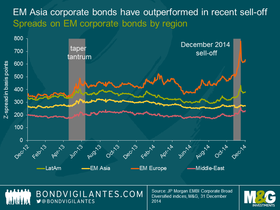
Most 2015 outlooks were released in late November or early December, when EM USD corporate bonds were boasting a solid 6.1% total return YTD (as at 26 November 2014). Since then, the deteriorating macro-economic dynamics in EM (slower growth, oil price decline and the Ruble turmoil) and a spillover effect from a weak US high yield market resulted in the largest EM spread widening since 2011. The index performance halved to 3.0% total return YTD as at 15 December, although it subsequently rebounded to about 5.0% as at year end. The sell-off saw a harsh repricing of bonds in Latin America, EM Europe, Middle East/Africa and…. that’s it. Asia was very resilient, unlike in previous sell-offs, as the chart below demonstrates.
In light of such major changes in the EM corporate bond markets in December since the sell-side released its 2015 outlooks, do Asian corporate bonds still look attractive on a relative basis?
Macro-economic risks: Asia is the least exposed, large downside risks in EM Europe, and increased risks in Latam and Middle East.
There is no doubt that Asia still faces significant macro risks in 2015, in particular China’s slower growth and shadow banking concerns, as mentioned by Jim in his recent video. However, on a relative basis, Asia is likely to be the least exposed to macro downside risks within the EM asset class. Latin America has its own problems with Brazil’s low growth and corruption scandals, potential or actual defaults of Venezuela and Argentina, low commodity prices, etc. Significantly lower oil prices are also affecting the Middle East and Russia, the latter being additionally hit by economic sanctions from the West due to its involvement in the Ukrainian crisis.
Not only does Asia face fewer macro-economic risks but some countries, such as India or Indonesia, are also likely to benefit from lower oil prices.
Valuations: Latam and EMEA have repriced, Asia is broadly unchanged.
While the recent EM sell-off has spared Asia, it has nevertheless led to a significant repricing of Latin American corporate bonds.
Looking at average spreads per turn of leverage (read spreads on a debt-adjusted basis), Latam bonds look attractive in the BBB and BB rating categories, while Asian corporate bonds offer more leverage-adjusted spreads than Latam bonds in the B category. It’s worth noting that B-rated issuers in Asia are, in my view, less transparent than Latin American issuers and that China’s enterprise bankruptcy law (EBL) still lacks testing for offshore bonds. This is important as default rates in Asia are expected to increase to 2.5% in 2015, from 0.9% YTD 2014.
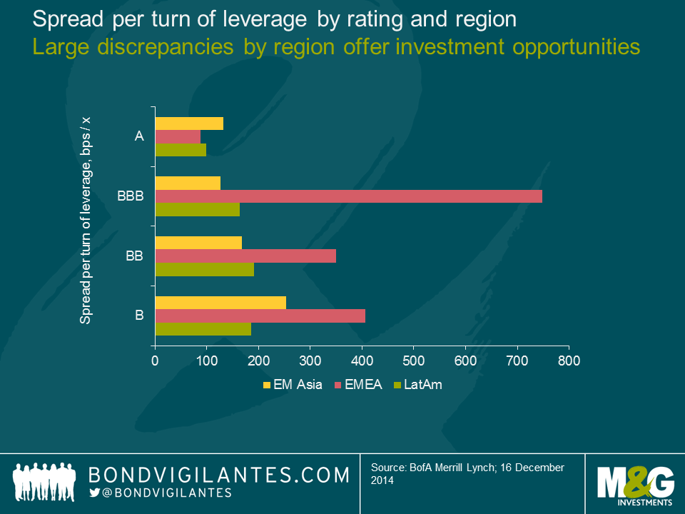
EM Europe corporate bond spreads look optically attractive (especially in BBB rated bonds) as spreads of a number of Russian and Ukrainian bonds reached distressed levels in 2014, whilst the region has low leverage ratios in general. However, EM Europe’s massive macro downside risk makes corporate fundamentals of less importance given many predict a default in Ukraine in 2015 and it’s uncertain in which direction oil prices and the Ruble will go next. On top of this, spreads also reflect the extremely poor market liquidity in the region
In the Middle-East, a few credits were unduly punished by the oil sell-off in the region and the repricing of some bonds has made them attractive on a selective basis.
Market technicals: the supply/demand dynamic will support Asia
With more than $170bn of US$ corporate bonds issued in 2014, Asia accounted for half of the 2014 global volume of issuance. China alone was c. 30%, according to JP Morgan. Going forward, the market expects Asian issuers to increase their share of global corporate bond issuance, with new records likely to be hit in 2015. One of the main risks for Asia is therefore a lack of demand to match the expected record supply numbers. However, unlike Latin America, Asian bonds are less sensitive to outflows from the US markets and Asia has built over the past years a larger local investor base that is expected to be a strong source of support to absorb the supply in 2015. For those not convinced yet, just look at how Asia was resilient during the December 2014 EM sell-off.
Conclusion: Asia likely to be resilient and Latam a volatile outperformer in 2015.
I believe the recent EM sell-off has in a sense reshuffled cards for 2015 as (i) it has generated more investment opportunities in Latin American corporate bonds and (ii) it has demonstrated Asia’s increasing resilience to other EM regions’ shocks. In my opinion, the spread widening in EM Europe corporate bonds has not been a major game changer for next year as geopolitical risks in Russia, hence also Eastern Europe, will continue going forward.
For 2015, I expect Latin American corporate bonds to be a driver of outperformance following the December 2014 sell-off while in the meantime being very volatile as the repricing of the region also reflects increased macro downside risks. Country and security selection will be key in Latin America.
Asian bond spreads do not look as attractive compared to corporate fundamentals; therefore, I would not expect a major spread tightening in the region in 2015, in particular in HY credits. However, Asia remains, in my view, the least exposed to macro downside risk and will likely be supported by positive market technicals throughout the year. As such, Asia’s increasing resilience to EM risk aversion might well be a good hedge to the rest of the EM asset class should bouts of volatility resurface in the marketplace.
“Hail Caesar, those who are about to die salute you” may well have been the gladiatorial epitaph of choice two millennia ago, but the junior creditors of Caesar’s Entertainment Operating Co are unlikely to feel the same way.
In 2008, TPG and Apollo Global Management, two powerhouses of the private equity industry, led a $30.7bn buyout of Harrah’s Entertainment Inc, the US gaming business. This was one of a wave of large LBOs at the time that was fuelled by the availability of cheap financing. Almost immediately, the debt-laden group began to struggle as the US economy stuttered and with a high debt burden, the group was unable to invest in new growth areas such as Macao. Seven years later, the group’s principal shareholders and secured creditors have bowed to the inevitable, agreeing to implement a large debt restructuring sometime early in 2015*.
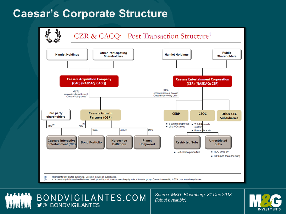
Much like the TXU bankruptcy in 2014, the Caesar’s restructuring will see a wide range of outcomes for its bondholders. Partly, this is due to the inherent complexity of the capital structure (see chart below). There are 3 main issuing entities (Caesar’s Entertainment Operating Co, Caesar’s Entertainment Resort Properties, and Caesar’s Growth Properties) and it should be noted the proposed restructuring will focus on only one of the entities (Caesar’s Entertainment Operating Co). The capital structure is a product of a range of re-financings, asset swaps, equity issues and other layers of financial engineering over the years.
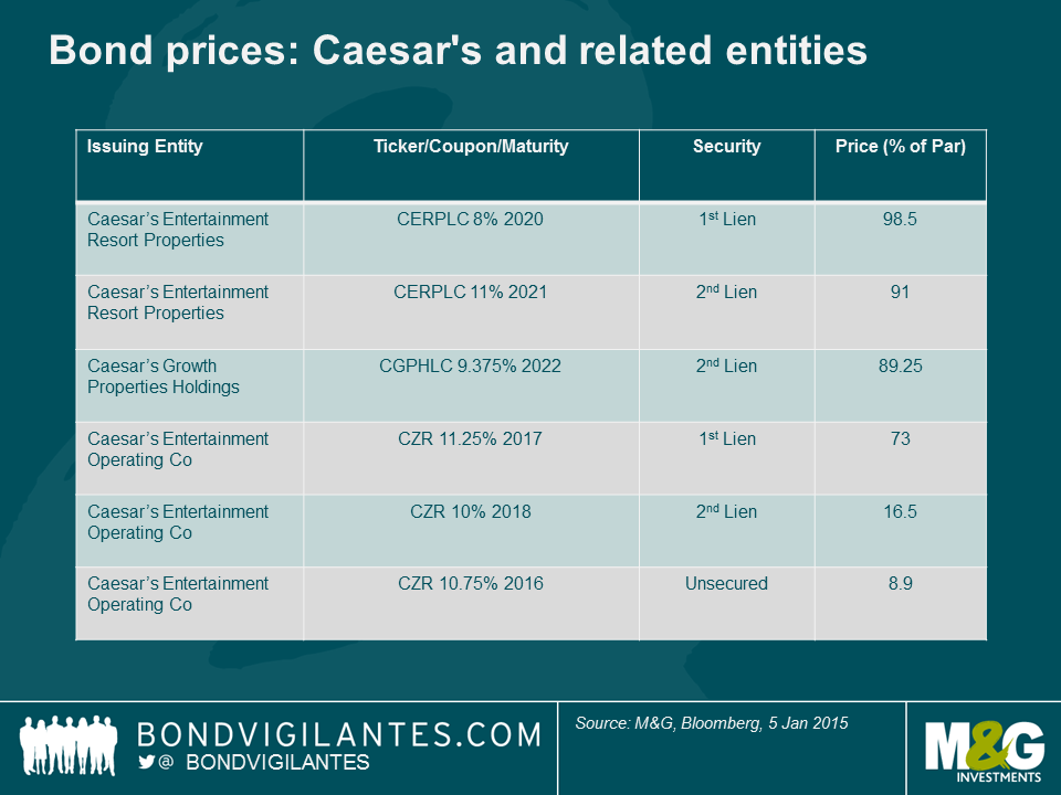
Also, within each issuing entity, there are distinct layers of seniority for various bonds, ranging from 1st lien through to unsecured claims. If we look at where a few of the more liquid bond issues are trading, we can see that the expected recoveries vary from close to par (i.e. next to no impact) for some bonds backed by direct senior claims over a range of properties, to around 12 cents in the dollar for some of the unsecured bonds.
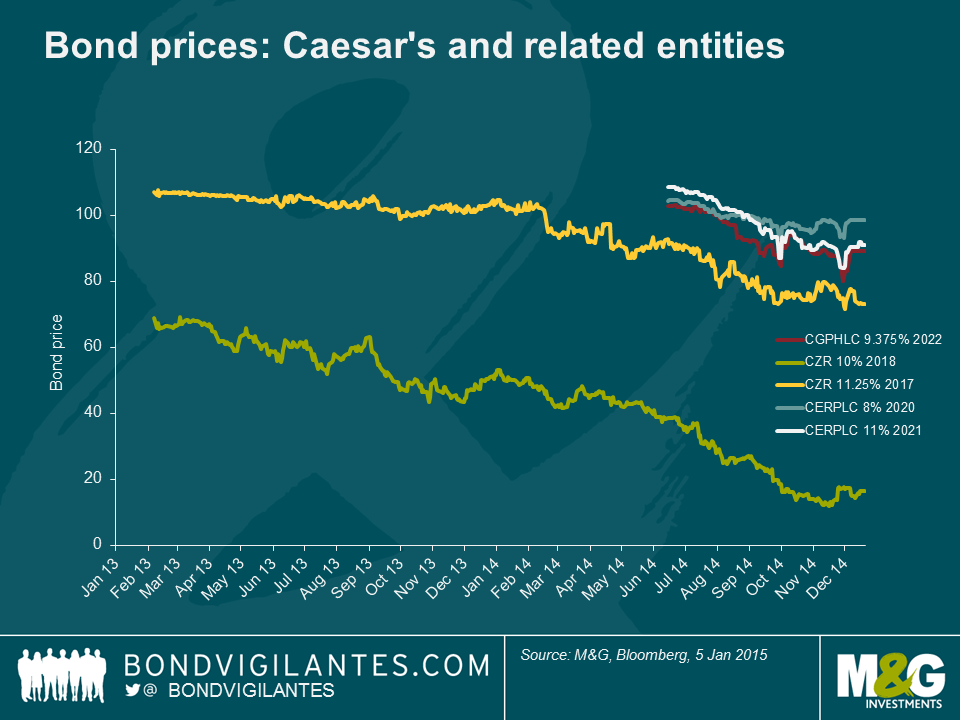
As the restructuring end-game came closer in 2014, the different position in the capital structure was also reflected in the price performance of the bonds. The unsecured claims, whilst already trading at distressed levels at the start of 2013, saw a further market-to-market loss of around 75% over the following 2 years.
This is another default that illustrates the potential downside risk of investing in a highly levered company. However, what the Caesar’s case also shows us is how some of the inherent asymmetry of corporate bond investing (big downside risk to capital with limited upside) can be mitigated by focusing on the more senior instruments within a capital structure. Consequently, the important question bond investors should ask themselves is not necessarily “if” they should lend to a company, but “where” in a capital structure they should put their money at risk.
Full Disclosure: M&G is a holder of Caesar’s Entertainment Resort Properties bonds.
*NB – this is still subject to gaining approval from other creditors and the US courts.


Sign up to the Bond Vigilantes mailing list to ensure you never miss a great article from our expert Bloggers. We will email all new articles to your inbox, meaning you can stay on top of the world of Bonds.
I confirm that I would like to receive information about Bond Vigilantes and products and services from M&G Securities Limited.
We will use the email address and personal data you have shared with us to send you this information. For existing customers, submitting your contact details and requesting to receive this information from us, will replace any earlier choices you have made in respect of marketing information.
You can unsubscribe from marketing at any time, at which point we will not send any further marketing information to you, by selecting the unsubscribe link in all communications.