The Fed’s Dots: Treasuries still dear, but no longer massively mispriced
Here’s an update of my favourite long term measure of bond market valuations. I’ve been updating this chart on the blog over the years, and if you’d bought and sold US Treasury bonds when they diverged significantly from the range implied by the Fed’s long term rate expectations, you would have done OK.
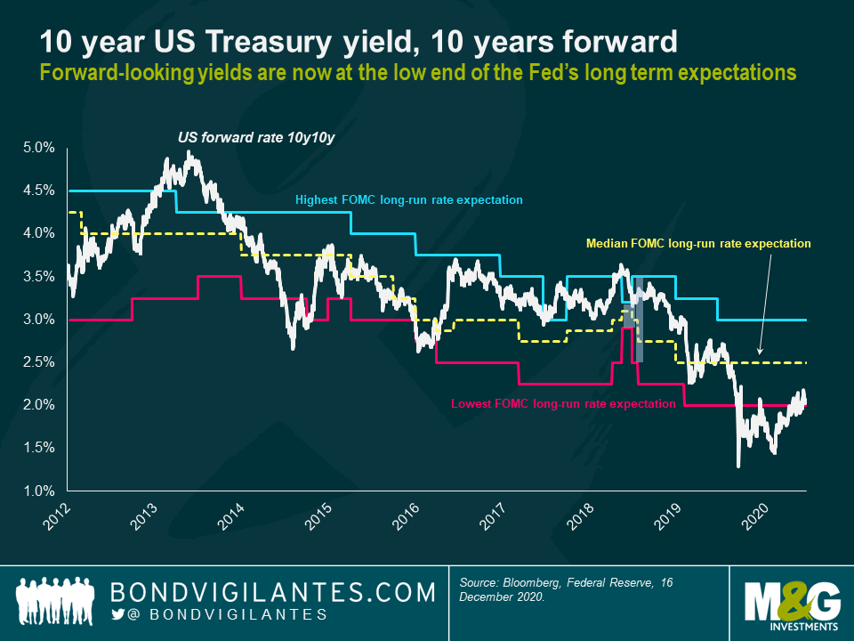
So what does my favourite chart show? I’ve shown the 10 year US Treasury bond yield, 10 years forward. This is derived mathematically from the US Treasury yield curve, and is the implied 10 year yield starting in ten years’ time: 2030. The beauty of using a forward rate is that it does away with shorter term noise; when we look at the period from 2030 to 2040, hopefully we don’t need to be talking about the strength or otherwise of the global Covid recovery, or about Trump and Biden political risk. It’s a measure based on long term expectations of rates based on inflation trends, potential growth, central bank mandate commitments, globalisation, government borrowing and demographics. At the moment, the 10y10y forward rate in the US is 2.09%, compared with the 10 year bond yield of 0.92% today. Remember that this is a nominal rate and that broadly inflation targets around developed economies are 2%. Effectively this means that the bond market is expecting real (inflation adjusted) yields in 2030 to be near zero.
The other part of the chart is the median level of the Federal Reserve’s “dots”, and the range of the highest and lowest expectations of FOMC members. Each quarter, the FOMC releases the “Dot Plot”, formally called its “Policy Path Chart”. Each of the 16 FOMC members estimates where the Fed’s short term interest rate will be at the end of the next three years, and over the long term. It’s that long term rate that I’m interested in, as it looks through the noise and short term economic uncertainties. Last night, following the FOMC meeting, the Fed left its dot plot unchanged. Rates for 2021 are expected to be left at 0% to 0.25%. This is despite the market consensus that 2021 US GDP will come in at an above-trend 3.8%, and despite a rise in inflation expectations—but remember that the Fed adopted Average Inflation Targeting during 2020, which allows it to let inflation move above its old 2% target if it’s been below 2% historically. The long term dot median was also unchanged at 2.5%, consistent with a real yield of something like +0.5%. The long term real rate of interest is also known as R* (“R-star”). The New York Fed publishes an estimate of R* based on the Laubach-Williams Model. Its inputs are GDP, inflation and the Fed Funds rate. At the start of the year, R* was estimated at over 1% on this model; it’s now below 0.5% post-Covid, consistent with a median long term “dot” of 2.5%. You can see the model’s output here: https://www.newyorkfed.org/research/policy/rstar.
The dislocation between trend growth and R* is dramatic. Ageing bond managers like me used to look at models that said, based on the Efficient Markets Hypothesis, that nominal bond yields should be roughly the same as nominal GDP growth. There shouldn’t, ex ante, be a different expected return in investing $100 in a US Treasury Bond than there should in putting $100 into the US economy (caveats around volatility excepted). Trading bonds on that model would have led you to miss 20 years of bond market rallies…
Anyway, here’s the chart.

From March onwards, the 10y10y forward US Treasury yield collapsed below even the most pessimistic FOMC member’s long term dot. Was it really likely that Covid would still be depressing interest rates between 2030 and 2040? Possible but unlikely. Selling bonds from March onwards looked attractive, and 10 year yields have nearly doubled since then from 0.5% to 0.92%. Now though, we are back within the Fed’s range of outcomes. It’s still at the lower end of range, and arguably bonds remain expensive. The market’s forecast for the 10 year bond yield at the end of next year is 1.3% and for 2022 it’s 1.5%, with a roughly parallel shift higher at longer maturities. Remember that bond markets have forecast higher bond yields every year for decades now, and have been wrong almost every time. I can buy the idea that US Treasury bond yields go higher from here, but the high water mark for them might end up being much lower than bond bears are predicting. You need to have some very good reasons to explain why a 40 year bull market in Treasuries is going to enter into sharp reverse.
Happy Christmas and a Happy New Year.
The value of investments will fluctuate, which will cause prices to fall as well as rise and you may not get back the original amount you invested. Past performance is not a guide to future performance.


18 years of comment
Discover historical blogs from our extensive archive with our Blast from the past feature. View the most popular blogs posted this month - 5, 10 or 15 years ago!


Bond Vigilantes
Get Bond Vigilantes updates straight to your inbox


