
Two big questions: recession and inflation – part 1

The economic backdrop post Covid remains one of great uncertainty regarding recession risks for credit, and inflation risks for bonds. We will attempt to address these issues in two blogs. The first will focus on our usual starting point over the years regarding the risk of recession; the second will explore the current inflation outlook from a fresh perspective, as we have not faced such high inflation in developed economies for many years.
Over the years we have looked at 3 key indicators of recession risk. The most recent occasions were at the start of the Covid pandemic and again earlier this year. Today we will update this as these indicators of recession risk have moved.
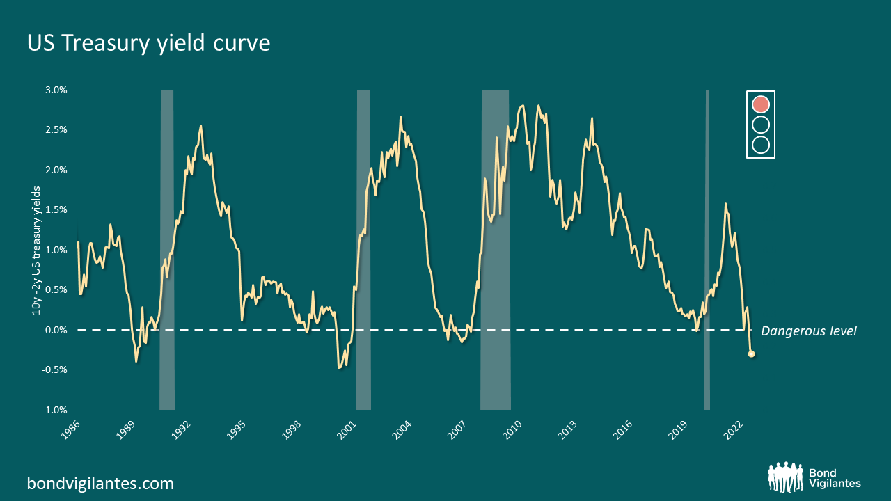
The first of these is the rightly well-favoured primary indication of upcoming recession: the inverted yield curve indicator. This has a good track record and is pointing to a sure recession ahead – it is the most inverted it has been in years as illustrated below, and one would argue is glowing red.
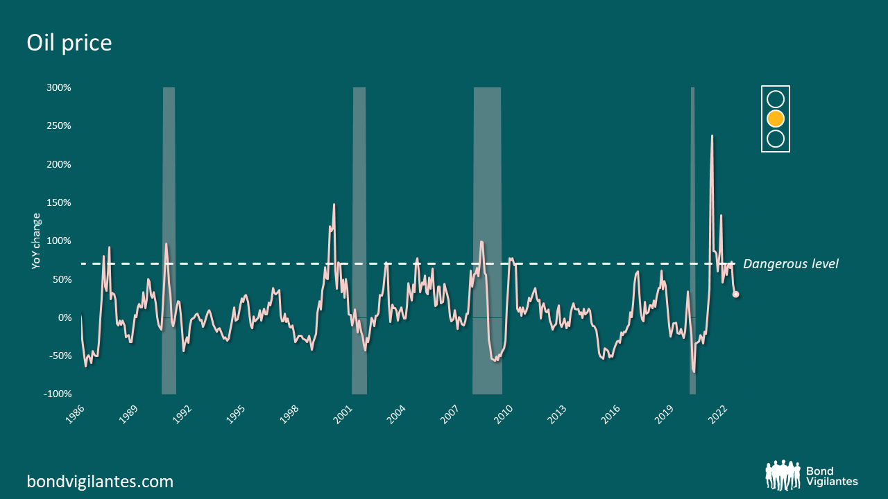
The second warning light comes from the price of oil. Below we can once again see its predictive powers. Currently the oil price indicator at a formulaic level looks amber, given recent weakness. I would argue that is not a recession warning for the USA, though other significant economies face a more recession risk due to currency weakness – in the case of Europe, the region also faces an historic energy price shock due to its reliance on Russian gas. Given the above I would also argue that energy is a potential red light for some economies.
Historically we have always looked for a third confirming signal of upcoming recession. The basic premise of this is that the Fed-induced inverted yield curve is created to fight inflation, usually from an energy shock, and this policy must find its way into the real economy. This transmission mechanism has historically happened through the housing market. We plot the likely direction of the housing market by looking at its sales-to-inventory ratio: when it takes a few months to sell available housing stock, the economy is set fair; when it takes longer than around 7 months, the economy faces problems ahead. This is illustrated below.
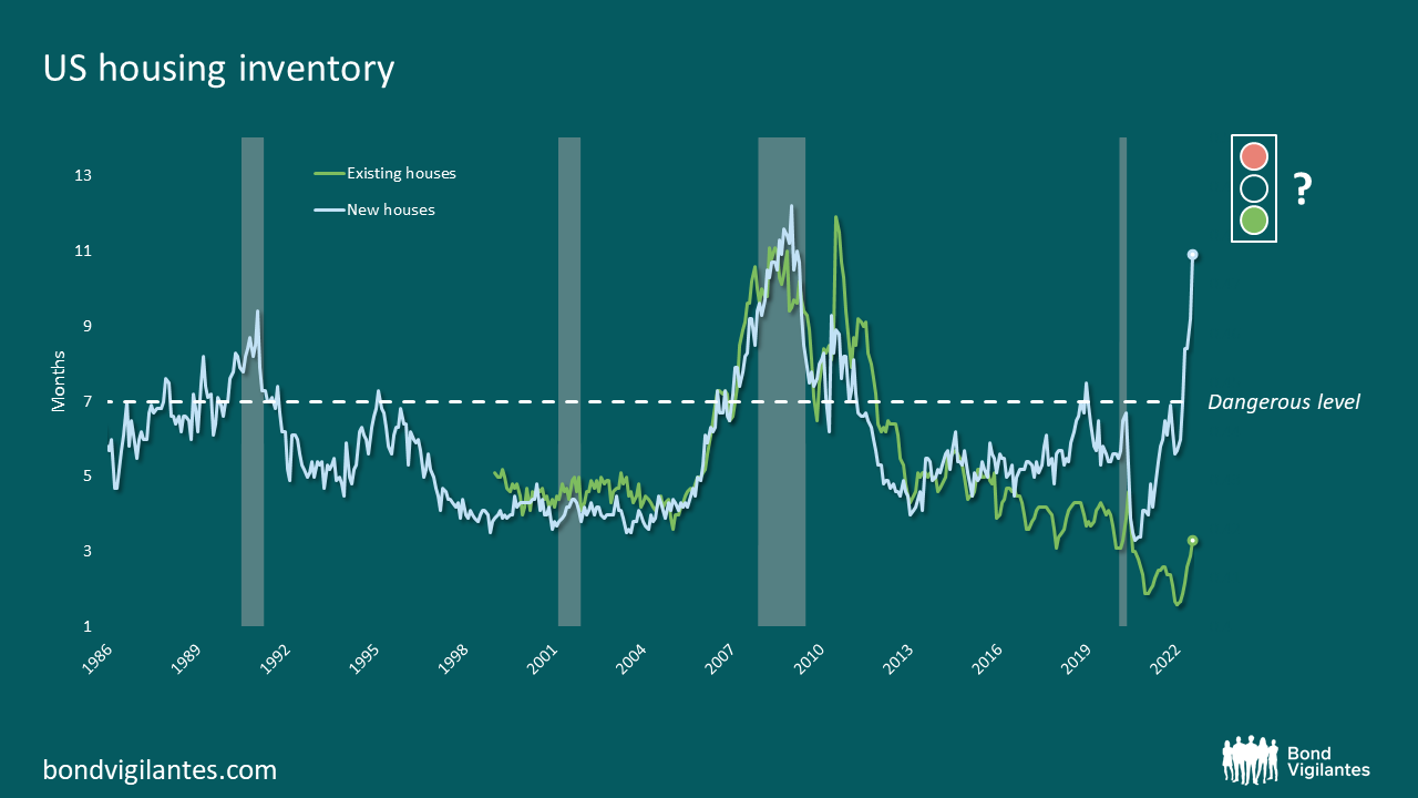
You can see from the historical graph above that this is a good indicator. We are faced with a dilemma when we update the data to today however, as we currently have a significant divergence between existing homes for sale inventory and new home for sales inventory. The former shows a robust healthy economy, while the latter implies an economy on the brink of an all-mighty recession. Let’s try to understand the difference.
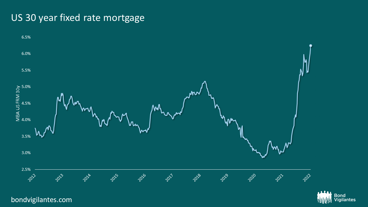
I think the reason for this divergence is the dramatic move in interest rates, from record lows to more typical rates, shown below. Different households face dramatically different interest rates. New buyers face the full force of Fed tightening, while existing holders will not sell as they will lose their locked in low rates if they move. This results in less demand for new build, slowing demand, and less supply of existing homes, slowing supply and explaining the dramatic divergence. Which is more important for the economy: the GDP impetus from new build housing, or the fact the majority of housing supply is now off market and so supporting prices and therefore consumer confidence? This ambiguity means this indicator could be bright green or bright red.
There is one other factor that is potentially very different this time and this is our often discussed labour market data. In a recession, unemployment by definition increases as shown below. This time around, we start in a very strange position with excess demand for labour at record levels. We would therefore need to work through this excess demand before we started increasing unemployment and experiencing a recession. This points to a delay or potential postponement of recession compared to a normal economic cycle.
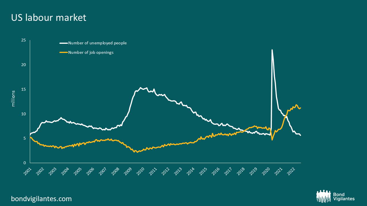
Traditional measures such as the yield curve point to a recession round the corner, with supporting indicators pushing generally in the same direction. The cushion of labour demand points to a potentially different outcome at least in the short term. Recession is highly probable to be further away than that implied by the most important signal, the inverted yield curve.
One other thing that is different this time is the historic inflation we have that is influencing central bank policy. We will focus on this in a second blog later today.
The value of investments will fluctuate, which will cause prices to fall as well as rise and you may not get back the original amount you invested. Past performance is not a guide to future performance.

