


What high-frequency indicators are telling us about the US economy

Traditional economic indicators have the advantage of being generally accurate as they use a comprehensive set of data. However, the disadvantage is that they come with a large time lag. You are told today, what has already happened few months ago. On the other hand, high-frequency indicators, while focused on smaller (and arguably less accurate) data sets, help us to get a sense of how the economy is currently doing.
The use of high-frequency indicators were very popular during the Covid pandemic as things were changing very quickly, however I think it is worth having a look at them again as we currently are in a very uncertain macroeconomic environment.
In this blog, I’ve attempted to put together some of the most popular high-frequency indicators which I will monitor going forward, in order to identify any signs of stress emerging in the US economy. All of them are publicly available and I’ve added the links to the data sources at the end of the blog.
I have grouped all indicators into 4 major groups: labour market, consumer behaviour, general economic activity and inflation.
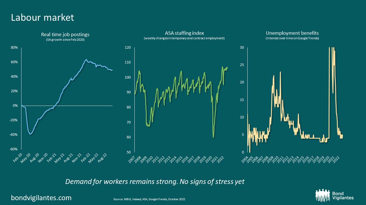
1) The US labour market
The slide below shows three popular high-frequency indicators for the labour market. Starting from the left hand side, you have the “real time job postings” from Indeed. This is confirming the trend we have seen over the last few months: demand for workers, whilst slowing, remains exceptionally strong. This will likely continue to remain so for the rest of the year as the ASA staffing index is still marching higher. This index tracks weekly changes in temporary and contract employment. Many companies rely on temporary help before hiring additional permanent employees, so staffing indices tend to lead actual employment by three to six months. Additionally, on the right hand side, I have added a chart looking at Google searches for “unemployment benefit”. This potentially gives us a real time picture of people concerned about layoffs. So far the number remains extremely low, indicating little sign of stress in the labour market.
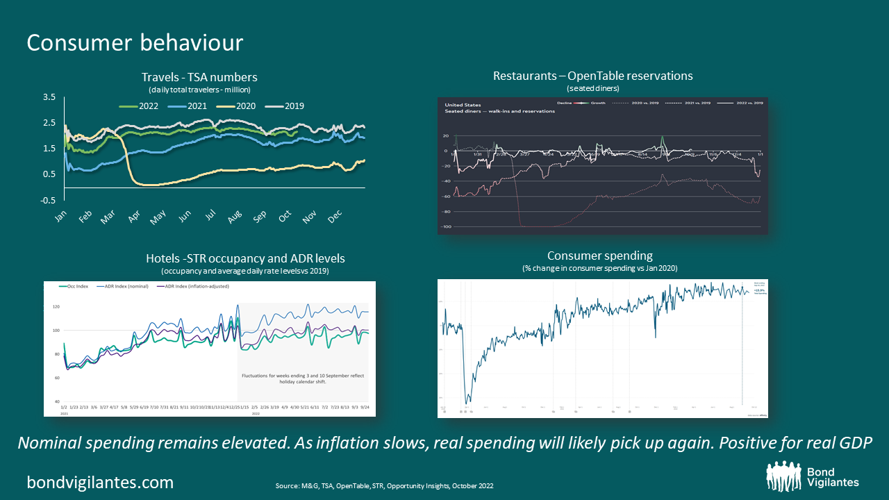
2) Consumer behaviour
Consumption is the largest component of US GDP, so it is always important to keep an eye on consumer behaviour and what people are doing with their money. Below are 4 high-frequency indicators which help us understand this. In particular, you can see how often people are travelling, going out to a restaurant or staying at a hotel. Overall it appears the economy is back to where it was pre-Covid and, despite higher prices, people are still spending. The chart on the bottom right is also very important as it shows overall nominal spending. Thanks to the strong labour market, nominal spending is holding-up well and if that continues while inflation keeps on trending lower, we are going to see a pick-up in real spending in the second half of this year. This will likely translate into increased GDP in real terms.
3) General economic activity
As stated above, high nominal spending in an environment of falling inflation will likely result in higher real spending and real growth. A pick up in real growth is also what we are seeing from the Atlanta Fed GDPNow and the OECD weekly GDP tracker. Both indices attempt to track economic activity in real time. After two consecutive quarters of negative growth, we now might start to see real GDP trending back into positive territory for the second half of this year.

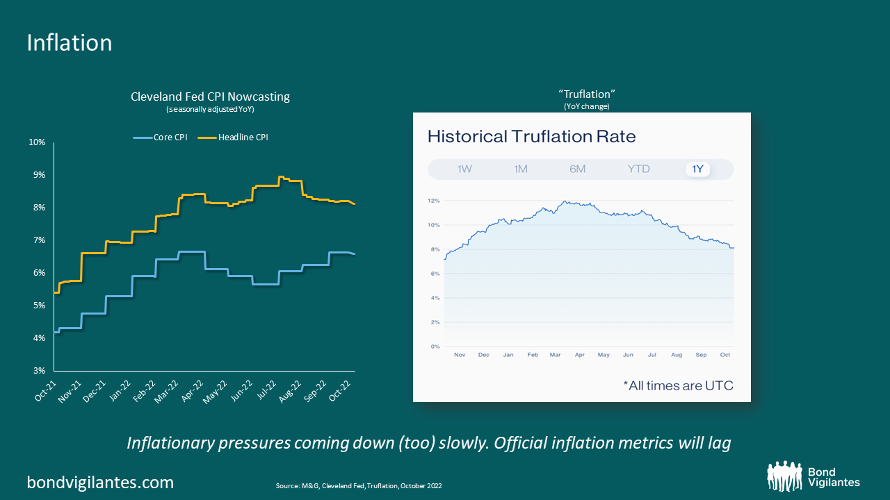
4) Inflation
Last but not least, is inflation. The chart on the left-hand side shows the Cleveland Fed’s estimates for current CPI. They tend to be fairly accurate and give us a good real time indication of what CPI is doing. The problem with CPI though, is that it is impacted by some lagging indicators. The most notable one is rents, which represents approx. 40% of core CPI. Due to the way it is constructed, rent CPI is not a good reflection of where rent prices are today, rather it is a reflection of what rents were a few months ago. Rent inflation has already started to decline, but this is not yet reflected in CPI. On the other hand, Truflation (right-hand side chart), looks at more real time data and as a result it might give us a better picture of current inflation. Overall it appears inflation in the US is slowing, but very slowly. This is because inflation is moving from goods into services, which unfortunately are more sticky.
The Fed is on a hiking path and certain things will likely start to break. The most rate sensitive parts of the economy e.g. the housing market, have already showed some clear signs of slowdown. However the economy overall is still holding up relatively well. This could change at some point, but traditional economic indicators won’t flag the potential areas of stress in a timely manner, while high-frequency indicators can.
In this blog we had a look at some of the most popular high-frequency indicators and so far they are confirming that the labour market remains relatively strong and people are still spending. Real growth will likely pick up in the second half of this year, while inflation will slowly trend lower. Going forward, it will prove sensible to keep an eye on these indicators, to see if things are starting to change and whether potential cracks are emerging.
Sources for the high-frequency indicators used in this blog:
- Real-time job posting: https://www.hiringlab.org/2022/06/09/data/
- ASA staffing index: https://americanstaffing.net/research/asa-data-dashboard/asa-staffing-index/
- Unemployment benefit: https://trends.google.com/trends/explore?date=all&geo=US&q=unemployment%20benefit
- Travels: TSA checkpoint travel numbers (current year versus prior year(s)/same weekday) | Transportation Security Administration
- Restaurants: https://www.opentable.com/state-of-industry
- Hotels: https://str.com/press-release/str-us-hotel-results-week-ending-1-october
- Consumer spending: https://tracktherecovery.org/
- Atlanta Fed GDPNow: https://www.atlantafed.org/cqer/research/gdpnow
- OECD GDP tracker: https://www.oecd.org/economy/weekly-tracker-of-gdp-growth/
- Cleveland Fed CPI Nowcasting: https://www.clevelandfed.org/our-research/indicators-and-data/inflation-nowcasting.aspx
- Truflation: https://truflation.com/
The value of investments will fluctuate, which will cause prices to fall as well as rise and you may not get back the original amount you invested. Past performance is not a guide to future performance.

