


The Great Escape… of UK Unemployment Reporting

The Bank of England Monetary Policy Committee potentially has a problem: it requires data to make its labour market forecasts and assessments, but the unemployment statistics have become increasingly unreliable. This is because the Labour Force Survey participation rate (on which the unemployment figures are based) has fallen below 50% since 2018 and has been as low as 15% recently[1]. What is the solution to this difficult measurement problem? An answer can be found in the classic war film, The Great Escape.
In 1943, the Escape Committee of Stalag Luft III was tasked with digging a tunnel to freedom. Unfortunately, they had a problem. They needed to measure the distance between one of the prisoner’s huts and the forest beyond the prison perimeter, but they had no reliable tools to measure this critical variable. Fortunately they had two mathematicians within the group who came up with a method to gauge the distance to the forest so that the tunnel would be long enough to ensure escape without detection. The idea was to eyeball the distance using a 20 foot tree for scale (the tree was the one ‘accurate’ measurement around which they could work with). They got individual prisoners to gauge the distance from the hut to the tree and then averaged all of the estimates. The critical distance measure was therefore the average of a large sample size of guesstimates. Fortunately, it more or less worked. Happily, modern economists have an equivalent to rely on in the area of unemployment. Their version of the Stalag Luft III tree strategy is something called the Beveridge Curve.
The Beveridge Curve is simply an observed relationship between an economy’s unemployment rate and its job vacancy rate at the same point in time. An excellent exposition can be found in the Bond Vigilantes archive[2]. When you plot the two variables against one another over a given period, the data points disclose a curve. This curve shows us that when unemployment increases, job vacancies decrease and vice versa. I have plotted the current curve below using the available data from the Office for National Statistics (ONS)[3]. The bottom left quadrant of the graph (the blue dots) relate to the Covid-19 era and the top left quadrant (the purple dots) represent the last 2 years’ worth of data. The green dots represent the remaining data from July 2004 to June 2023.
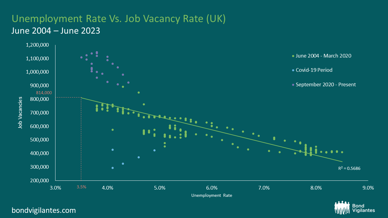
Source: Office for National Statistics, Dataset JP9Z & UNEM
Source: Office for National Statistics, Dataset JP9Z & UNEM
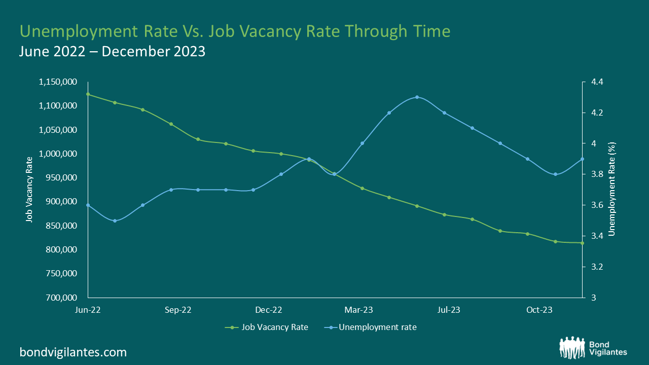
From these charts and new data from the ONS, we can observe that in the UK, the level of unemployment is increasing and that the job vacancy rate is decreasing. At face value, this suggests that current Bank of England monetary policy is working and that the inflation rate is slowing as the economy cools. One could argue that we are on track for a reasonably soft landing. Nothing new so far.
Things become more interesting when we consider the Beveridge Curve in conjunction with the most recent job vacancy data. We are told that there are now 814,000 job vacancies as of the 31st December 2023[4]. Ordinarily, we would use the curve and clearly be able to extrapolate from the Job Vacancy data what our Unemployment figure might be. However, we also know that the current unemployment data is unreliable, which makes this harder. Using our model inclusive of data oddities, we could extrapolate that with 814,000 job vacancies, we might expect an unemployment rate of around 3.5%. Yet, we know that our unemployment figures are unreliable so the question therefore is, how big an increase in unemployment are we likely to see given what we know about job vacancies?
In order to estimate the magnitude of the rise in unemployment, we need to look further afield. If we study the levels of economic inactivity in the UK, we can observe that they have remained stationary at 22%[5] for the last decade. We can also see that the population of the UK has risen over the same period by around 5.91%[6]. Further, we know that the Labour Force Survey (LFS) samples 40,000 households per quarter to obtain its data, but of late has had a response rate of only 15% (6,000 households). Therefore a critical question for policy makers is what is happening with the 85%, the non-responders?
Given the small sample size, it is entirely possible that the LFS suffered survey bias that is being erroneously weighted away. In other words, the LFS compensates for the paucity of response data by accessing other regional population statistics as a legitimate part of their methodology. The problems of non-responders are being addressed in upcoming LFS releases but for the time being, the data is not as clear as it ought to be. With such a small sample size, it seems possible – indeed probable – that unemployment levels are being underreported. This would explain why the current unemployment rate of 3.8%[7] is dramatically lower than the historic average of 6.7% (1971-2023). We see further evidence for this in the forecasts of the UK’s unemployment rate on Bloomberg which have been consistently above the actual levels for the last few published data points. So whilst the published headline figures might be looking reasonable, the underlying story looks like it could be hiding something more sinister.
Through it all, the Beveridge Curve remains a reasonable template. Job vacancies are definitely falling, so we should expect to see unemployment rising. Like the Stalag Luft III measurement solution, the Beveridge Curve offers a constructive way out of our present statistical dilemma. That being said, analogies can only be taken so far. Unfortunately for the inmates of Stalag Luft III, the calculation didn’t quite work and the tunnel came up short. No one actually made a Great Escape. What does this mean for UK unemployment data? Time may tell.
[1] The UK’s ‘official’ labour data is becoming a nonsense (harvard.edu)
[2] https://bondvigilantes.com/blog/2013/11/a-shifting-beveridge-curve-does-the-us-have-a-long-term-structural-unemployment-problem/
[3] Unemployment – Office for National Statistics (ons.gov.uk)
[4] https://www.ons.gov.uk/employmentandlabourmarket/peopleinwork/employmentandemployeetypes/timeseries/jp9z/unem
[5] https://www.ethnicity-facts-figures.service.gov.uk/work-pay-and-benefits/unemployment-and-economic-inactivity/economic-inactivity/latest/#:~:text=data%20shows%20that%3A-,22%25%20of%20working%20age%20people%20in%20England%2C%20Scotland%20and%20Wales,for%20a%20job)%20in%202022
[6] https://www.ons.gov.uk/peoplepopulationandcommunity/populationandmigration/populationestimates/bulletins/annualmidyearpopulationestimates/mid2021
[7] https://www.ons.gov.uk/employmentandlabourmarket/peoplenotinwork/unemployment
The value of investments will fluctuate, which will cause prices to fall as well as rise and you may not get back the original amount you invested. Past performance is not a guide to future performance.

