


UK housing market flashing amber
The July RICS survey continued the worrying trend of weaker UK data that has been in evidence since the preliminary UK Q2 GDP data release on July 23rd. It seems that the economic slowdown that has been evident in the US in the past few months is no longer contained to the US alone. The survey showed that UK surveyors are on balance seeing house price falls rather than rises, the first time this has been the case since July 2009, and signs of both weakening demand and greater supply meant that future price expectations turned more negative.
We’ve focused on the UK and US housing markets on this blog a lot over the years, and forward looking indicators such as sales/stocks ratios or mortgage approvals played a primary role in shaping our exceptionally gloomy view on the UK and US housing markets (and hence financial markets) in 2008. The correlations between the variables has changed, as correlations always do, but you can definitely get a feel for which way the UK housing market is headed by eyeballing this updated chart, which plots UK house prices against the RICS sales/stocks ratio (ie the number of sales that estate agents have made over a rolling 3 months divided by the total number of properties that estate agents have on their books). A low ratio implies a glut of supply and/or poor demand, while a high number suggests houses are flying off estate agents’ books.
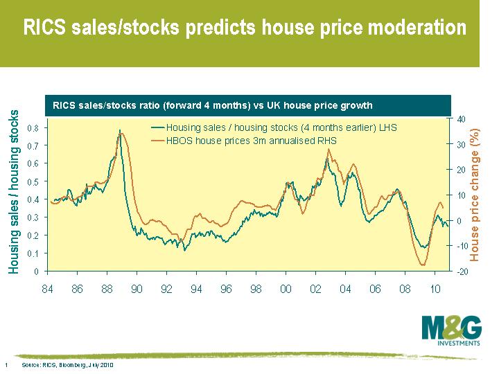
The RICS sales/stocks ratio doesn’t suggest that the UK housing market is about to fall off a cliff, but it does suggest that the short term outlook is for flat or slightly negative prices. This isn’t necessarily surprising considering that UK house prices moved sideways in the aftermath of the last housing crash in 1993-1995. But the concern is that the enormous monetary and fiscal stimulus of the past two years has only served to temporarily halt the decline in house prices, and house prices in the UK in particular still look very overvalued relative to average earnings. Another leg of house price declines will place significant strain on the already vulnerable banking sector, which would leave us looking more and more like Japan.
Returning to the recent trends in global economic data, some of the US slowdown may simply be because the economic benefit of the huge monetary stimulus at the end of 2008 has now worked its way out of the system (monetary policy operates with about an 18 month lag, as suggested in last week’s blog). The Bank of England didn’t move quite as rapidly as the Fed, with the final rate cut taking place in March 2009. The UK is only now starting to face a slowdown, which will likely be highlighted in the Bank of England’s quarterly inflation report released tomorrow. European data remains remarkably strong, although this may be partly because the ECB was slower and less forceful in implementing monetary policy (the final rate cut didn’t occur until May 2009). There have of course been numerous additional monetary and fiscal responses around the world since May of last year, but the beneficial effect of the ECB’s rate cuts will cease to be felt over the next few months and I’d expect European economic data to begin to weaken.
The value of investments will fluctuate, which will cause prices to fall as well as rise and you may not get back the original amount you invested. Past performance is not a guide to future performance.
19 years of comment
Discover historical blogs from our extensive archive with our Blast from the past feature. View the most popular blogs posted this month - 5, 10 or 15 years ago!


Bond Vigilantes
Get Bond Vigilantes updates straight to your inbox