


Is the Federal Reserve running out of ammo, and if so, what does this mean for financial markets?
Almost every financial asset seems to have gone up – in the last year, you’d have made money if you’d bought US Treasuries, corporate bonds, gold or even Italian equities. It’s only really emerging market currencies or EM equities that have disappointed. The concept of portfolio diversification and uncorrelated asset classes seems to have gone out of the window, but who cares when everything’s going up, right?
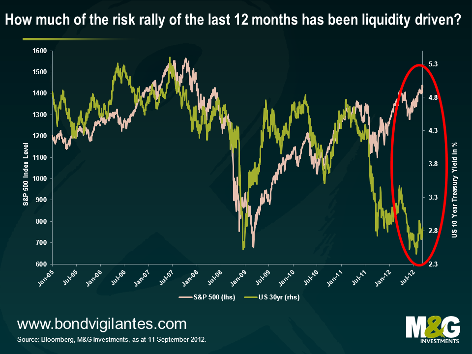
The first chart illustrates this point, showing the S&P 500 (pink line, left axis) against the 30 year US Treasury yield (green line, right axis). US Treasury yields and US equities used to be strongly correlated, but in the last year Treasury yields have collapsed while equities have soared to 2007 levels. The time value of money concept suggests it makes sense for equities to rally if US treasury yields have collapsed, because all else being equal, the present value of a company’s dividends or free cash flow or whatever you’re looking at has increased dramatically owing to the much lower discount rate.
Still, this correlation breakdown bothers me. If it’s correct that everything has rallied on the back of the promise of central bank liquidity, then presumably every asset class can also fall if this liquidity is no longer available.
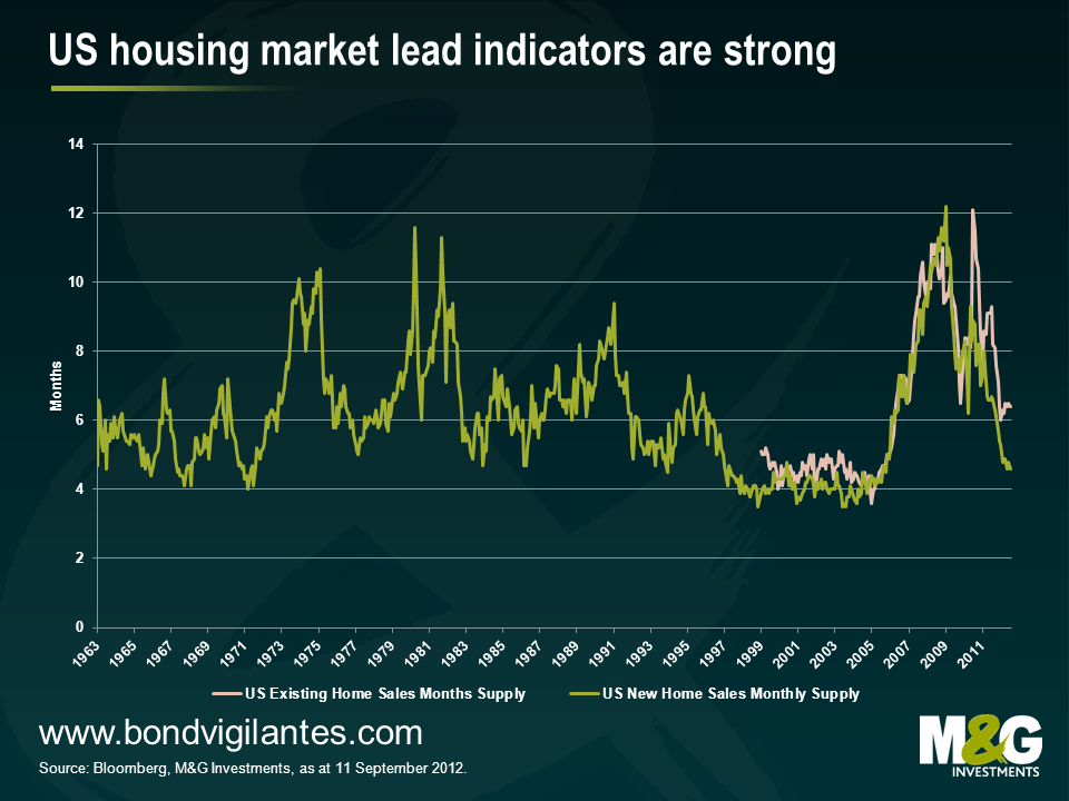
The central bank that seems to me to be closest to running out of policy options appears to be the Fed. Sure, unemployment is falling at a painfully slow rate, but unemployment is a lagging indicator. Probably the most important thing for the US economy is the US housing market. The US consumer may be close to having delevered, and if the housing market rallies, consumers are fine, banks are fine, banks can start lending again and economic growth can return. US house prices are (just) increasing again, and some of the lead indicators are unquestionably bullish. In 2021/12 we focused a lot on measures such as the months supply of houses, which says how long the supply of houses on the market will last at current levels of demand. In 2021/12 we showed that this measure was predicting a US recession (see here), whereas this lead indicator is now suggesting the total opposite – the months supply of new homes (for which there is a much longer history) has only looked more favourable a handful of times in the last 50 years, and is closing in on the go go years of 1997-2005.
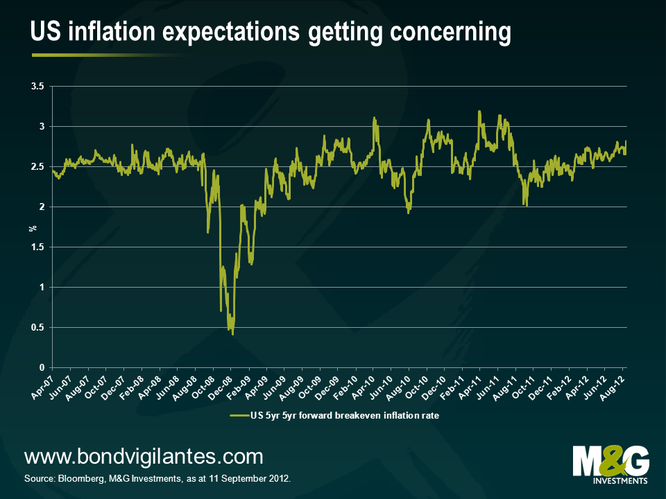
This chart also bothers me. The Federal Reserve’s favourite measure of market implied inflation expectations is the 5 year 5 year forward breakeven inflation rate, and inflation expectations have recently risen above 2.8%, the highest in over a year. Admittedly part of the increase in inflation expectations has been due to Bernanke’s comments, but it’s noticeable how much higher inflation expectations are today versus where they were in summer 2010, when the Fed indicated it was getting ready for QE2.
It’s possible that we’ll see additional stimulus from the Fed over the coming months and years, and we are still very far away from a 1970s-style stagflationary environment that would likely see all asset classes really suffer. But the ‘Bernanke put’ is becoming a lot harder to justify, and this could pose problems to both ‘safe haven’ assets as well as risky assets.
The value of investments will fluctuate, which will cause prices to fall as well as rise and you may not get back the original amount you invested. Past performance is not a guide to future performance.
19 years of comment
Discover historical blogs from our extensive archive with our Blast from the past feature. View the most popular blogs posted this month - 5, 10 or 15 years ago!


Bond Vigilantes
Get Bond Vigilantes updates straight to your inbox